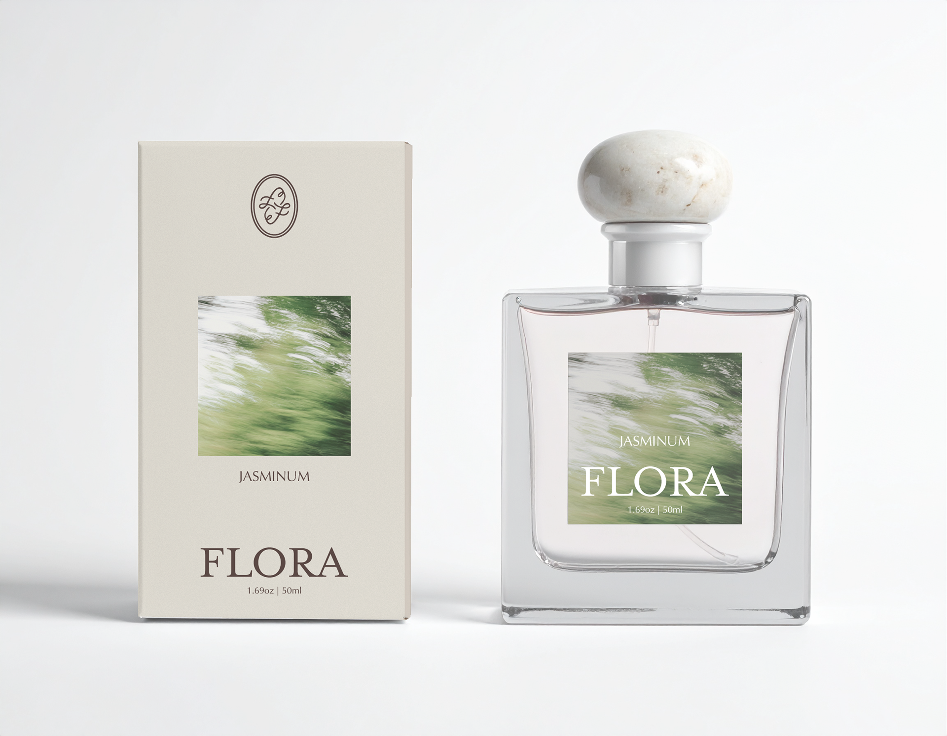
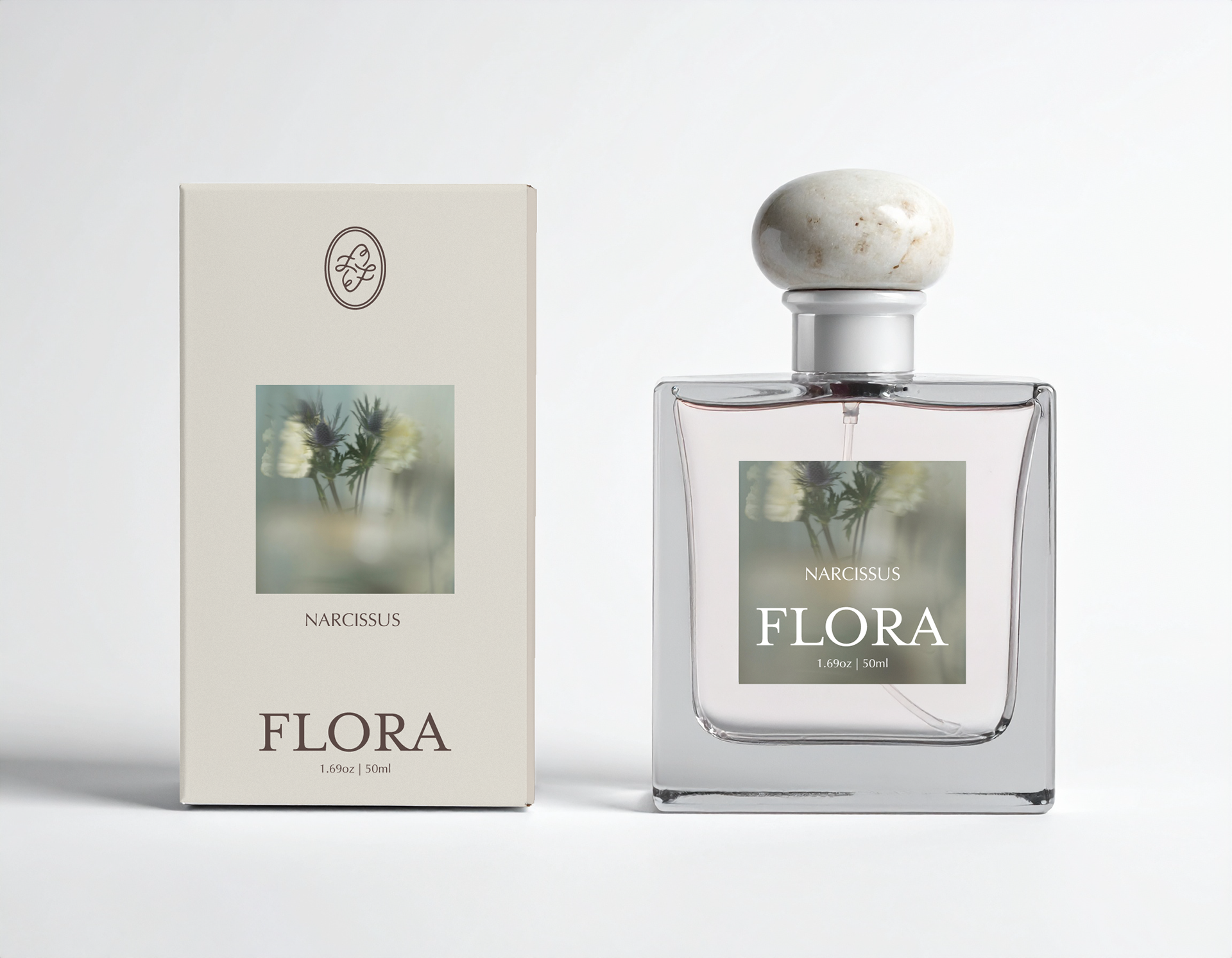
Overview
Flora is a gender-inclusive, niche fragrance brand concept designed for scent connoisseurs who prioritize high craft and distinct, single-note botanicals. Rooted in the philosophy that nature’s simplest expressions are its most profound, the brand dedicates each fragrance to the raw essence of a single flower.
The visual identity seamlessly bridges the past and the present, drawing inspiration from antique apothecary bottles and organic textures to create a timeless, heirloom-quality aesthetic. This project encompasses the comprehensive brand strategy, bespoke packaging, and a minimalist digital experience that positions Flora as a modern classic in the artisanal perfume market.
Logo and Brand Identity
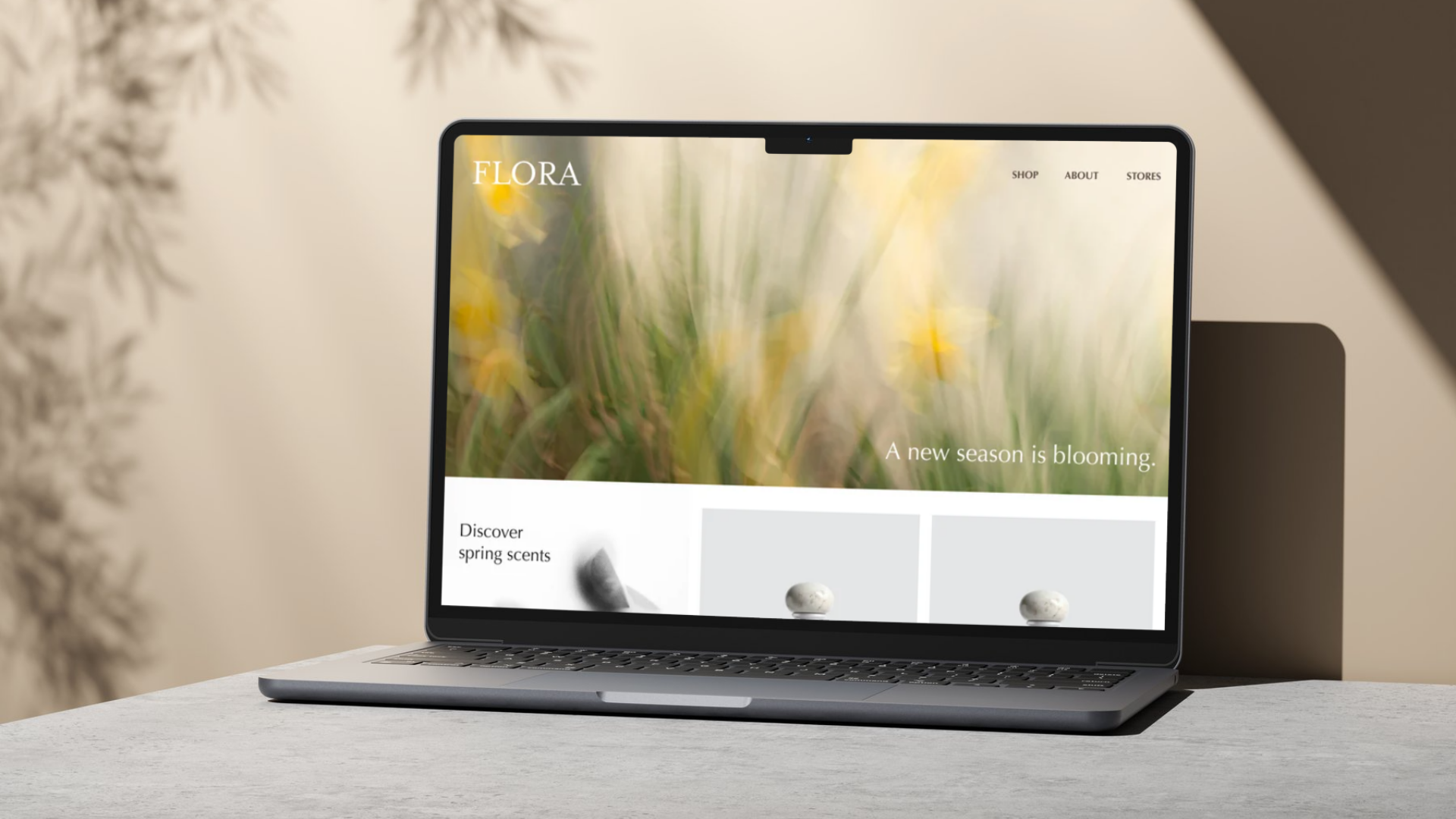
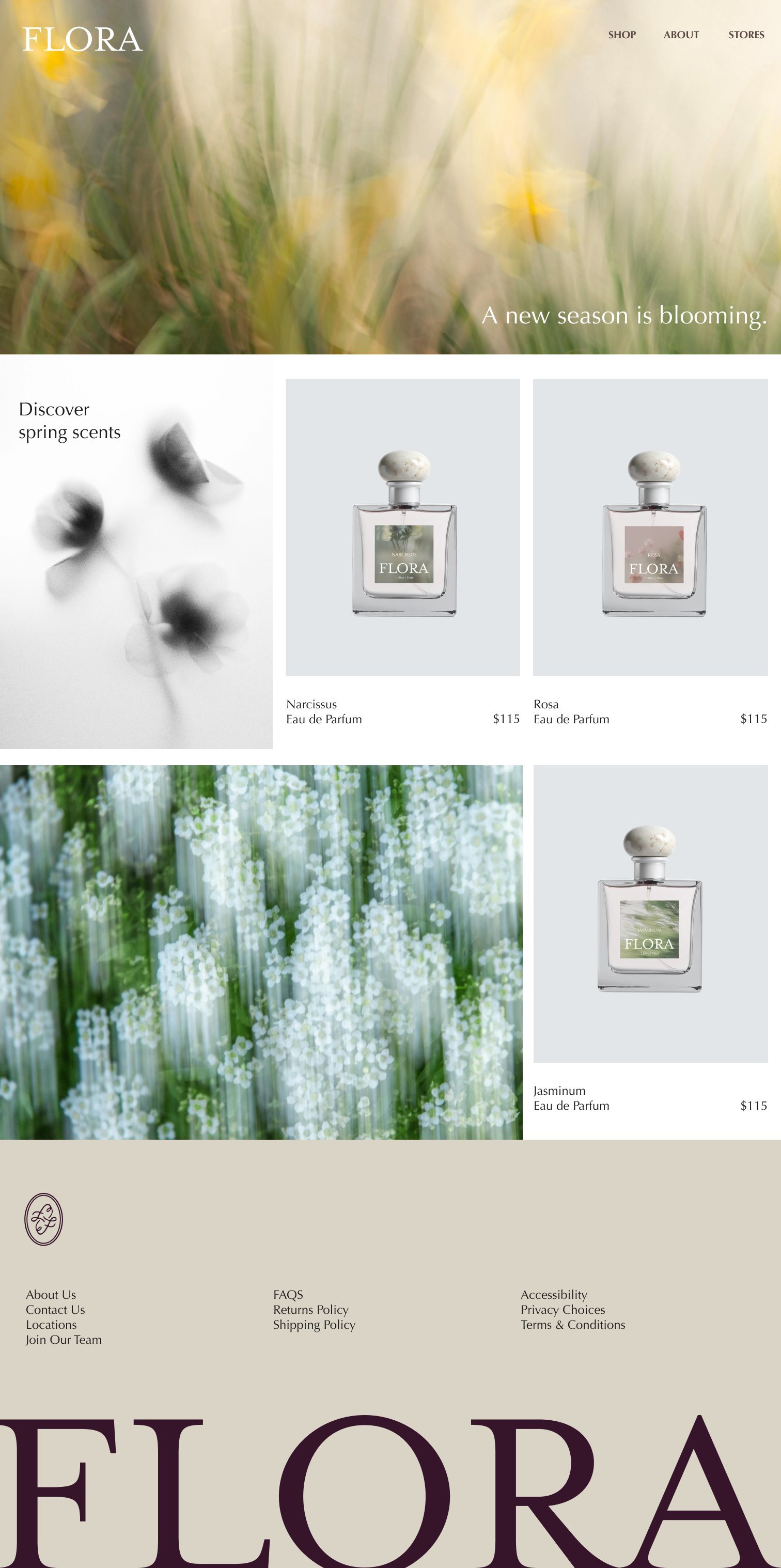
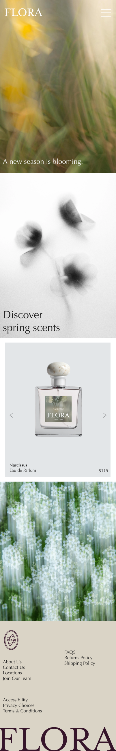
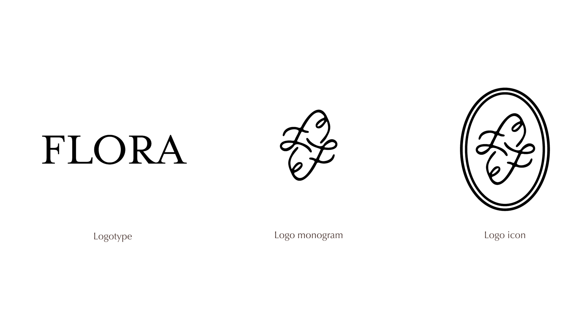
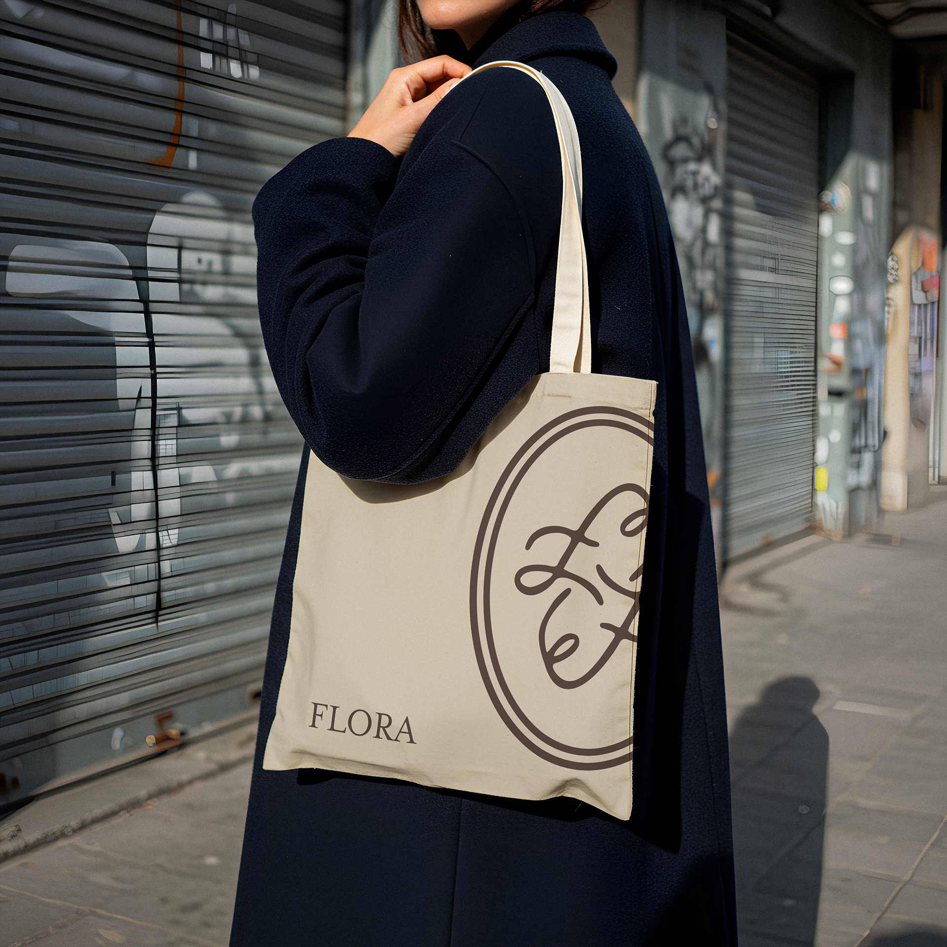
The visual identity for Flora centers on a typographic and tactile blend of heritage and nature. The logotype utilizes the elegant serif typeface, Mrs Eaves OT, set in all caps to evoke a timeless, faintly historic quality reminiscent of classic literature and vintage printing presses.
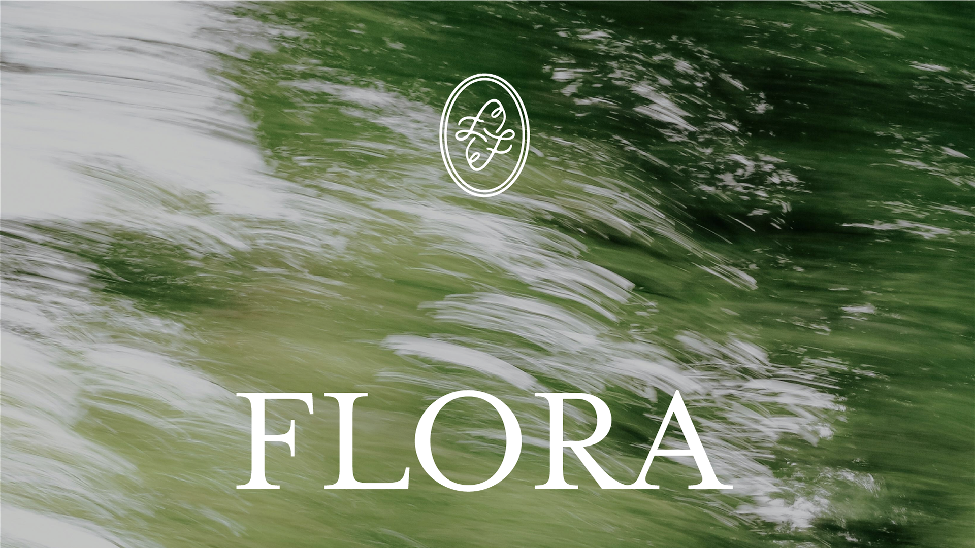
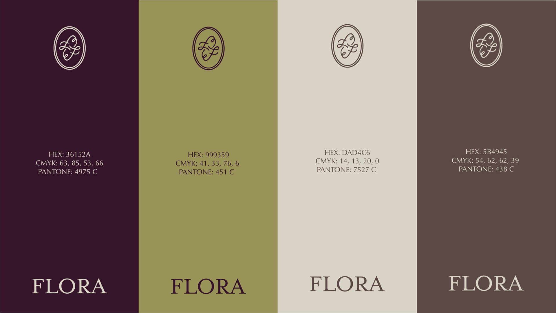
To complement this structured elegance, the brand icon and monogram feature a custom, hand-drawn calligraphic "F." Designed with deliberate imperfections, the icon mimics the loose strokes of a handwritten letter and the texture of a traditional wax seal stamp.
This structured-yet-organic duality is grounded by a color palette drawn from rich earthy tones: deep soils, mossy greens, and muted terracotta—visually tying the identity directly back to the roots from which each flower blooms.
Logo sketch process
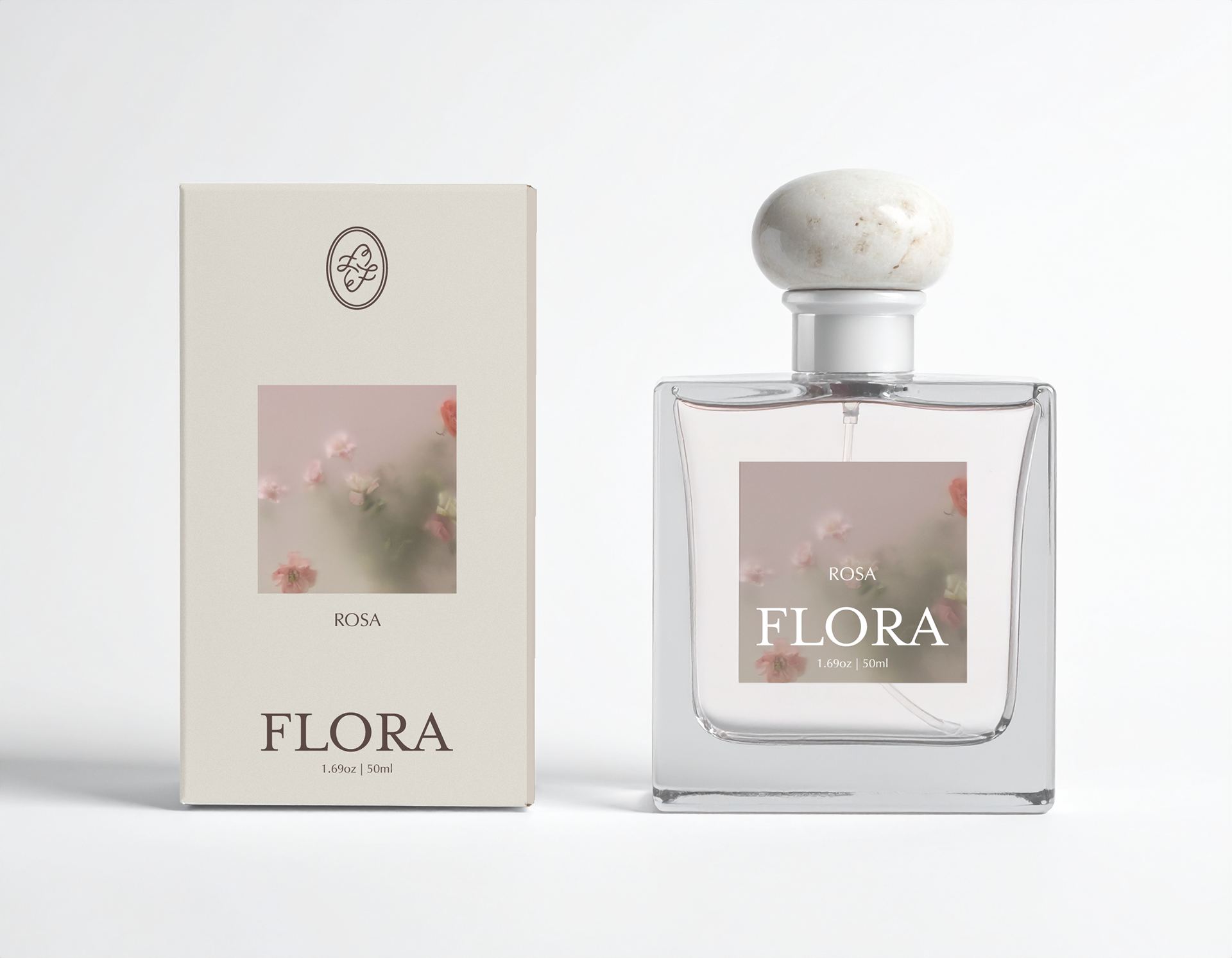
Package Design
Web and Mobile Design