Overview
Mangia! is a contemporary Italian food magazine concept that brings a bold, indie spirit to the culinary scene. Designed for a millennial and Gen Z audience, the magazine celebrates Italian cuisine through a modern, urban lens—highlighting chefs, restaurants, and food culture across U.S. cities.
The design fuses punchy colors, whimsical illustrations, and vibrant photography — a mix of candid moments and styled compositions—to create a visual experience that feels both playful and refined. The tone of voice is confident and conversational, echoing the passion and energy of the people behind the dishes.
I wanted Mangia! to be more than just something you flip through. It’s designed to look just as good sitting on your coffee table or kitchen counter as it does in your hands. Part magazine, part decor, and fully fueled by a love for food, design, and storytelling.
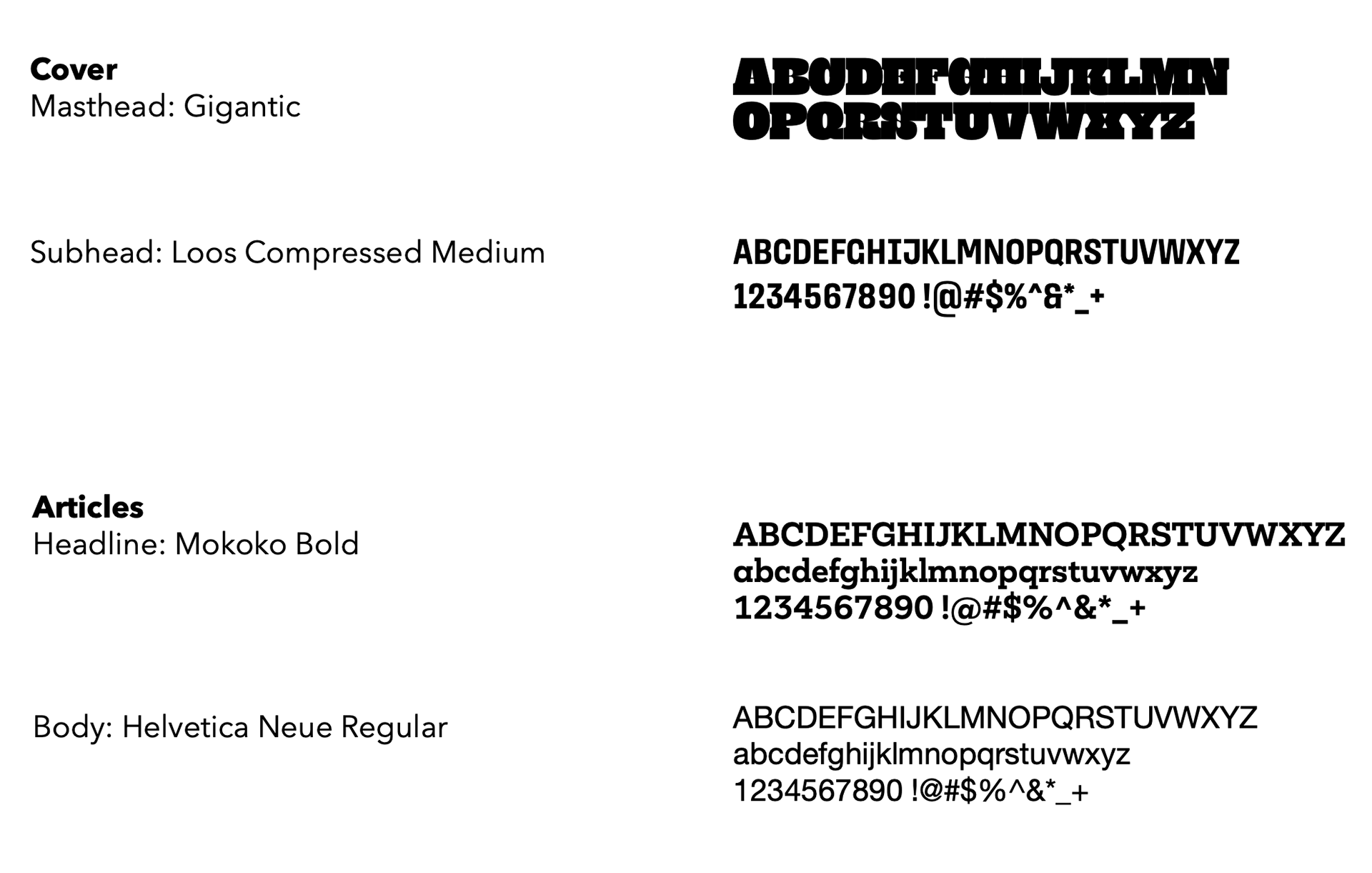
Masthead Design
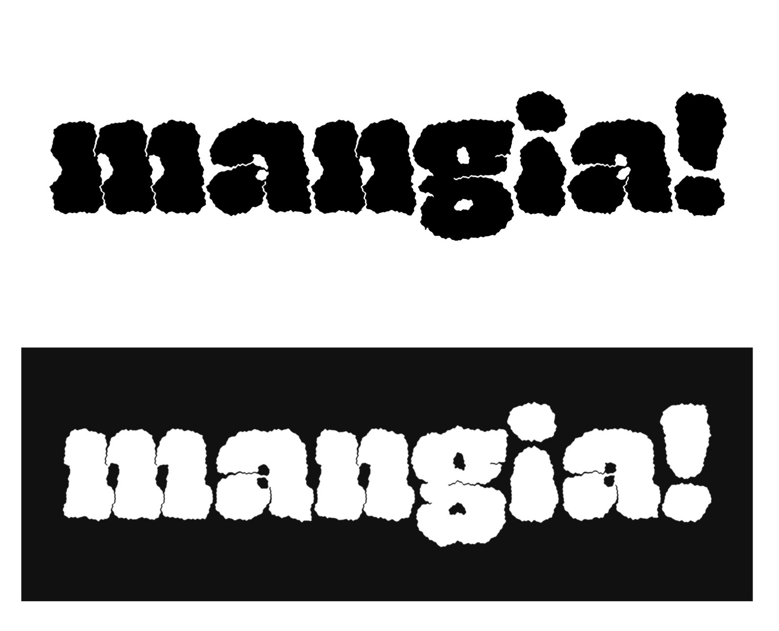
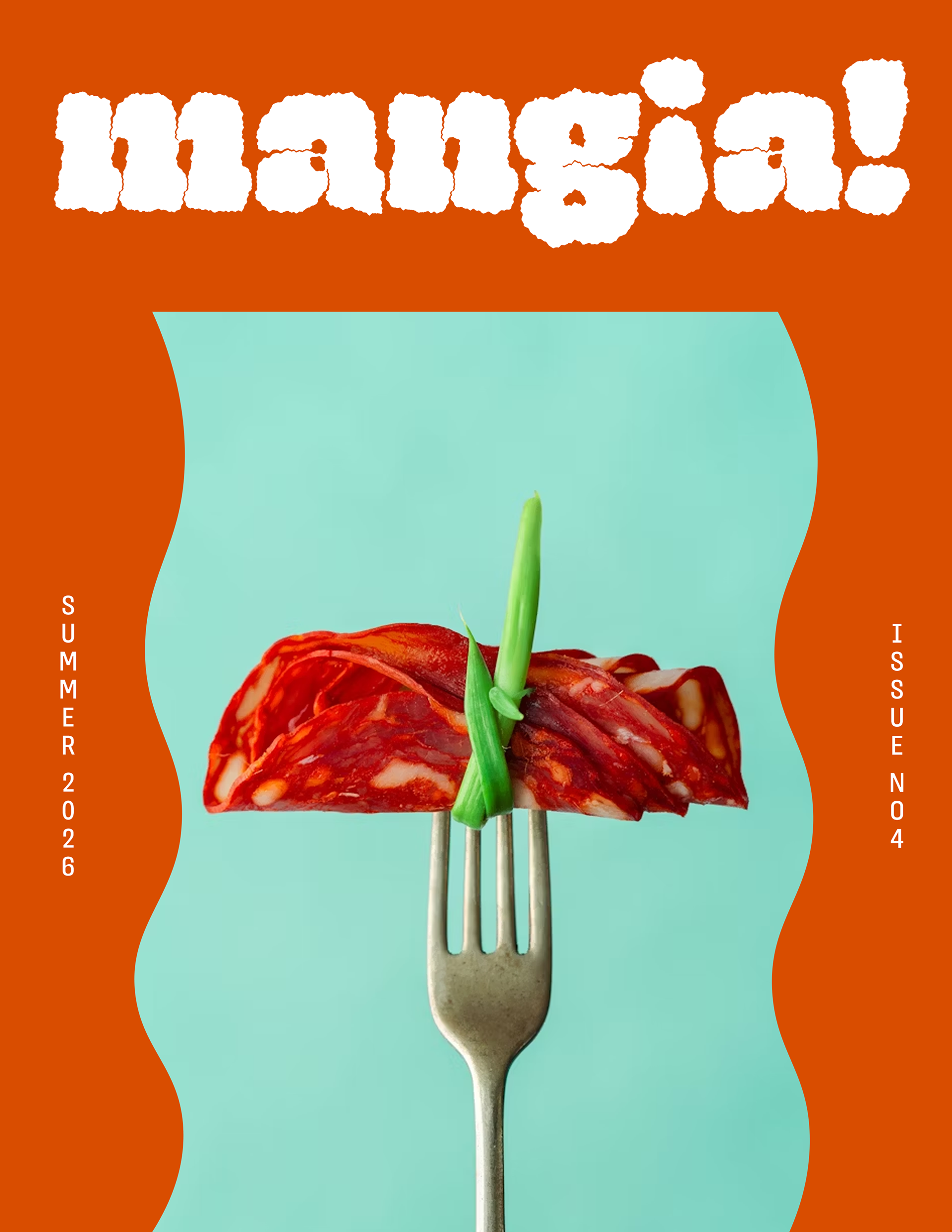
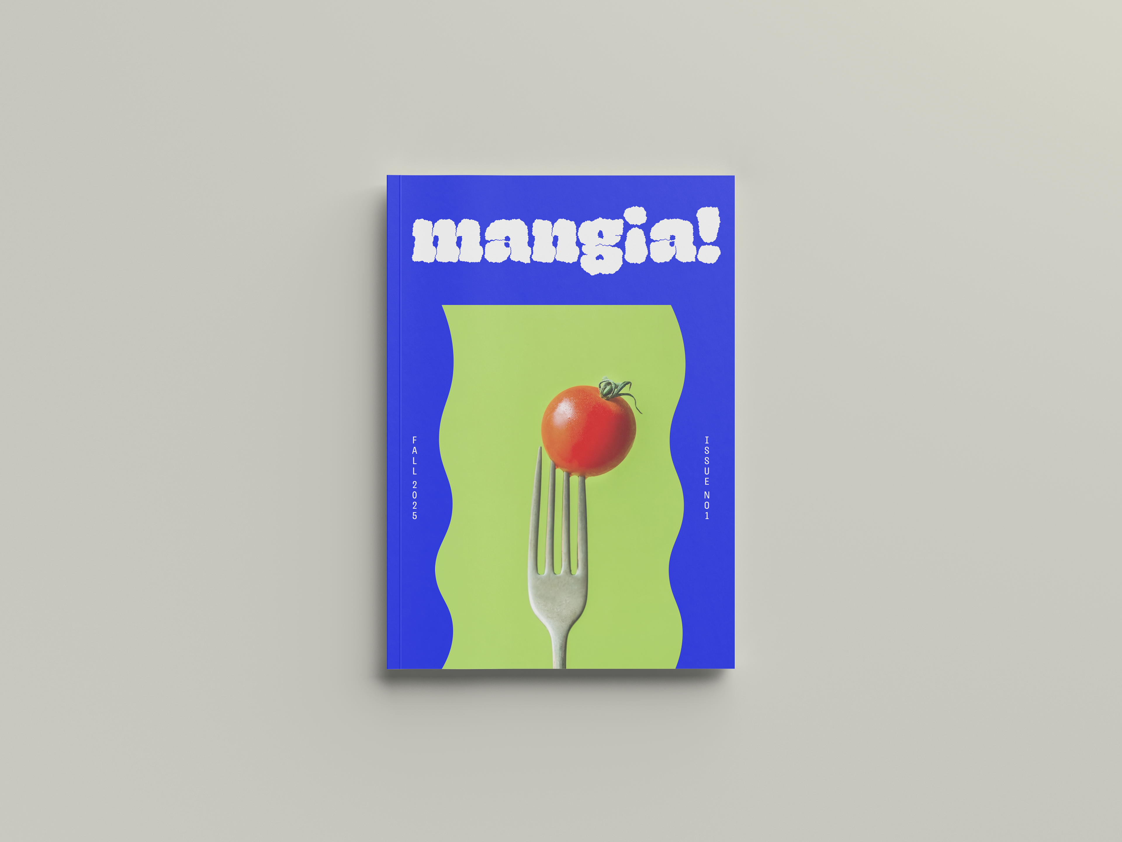
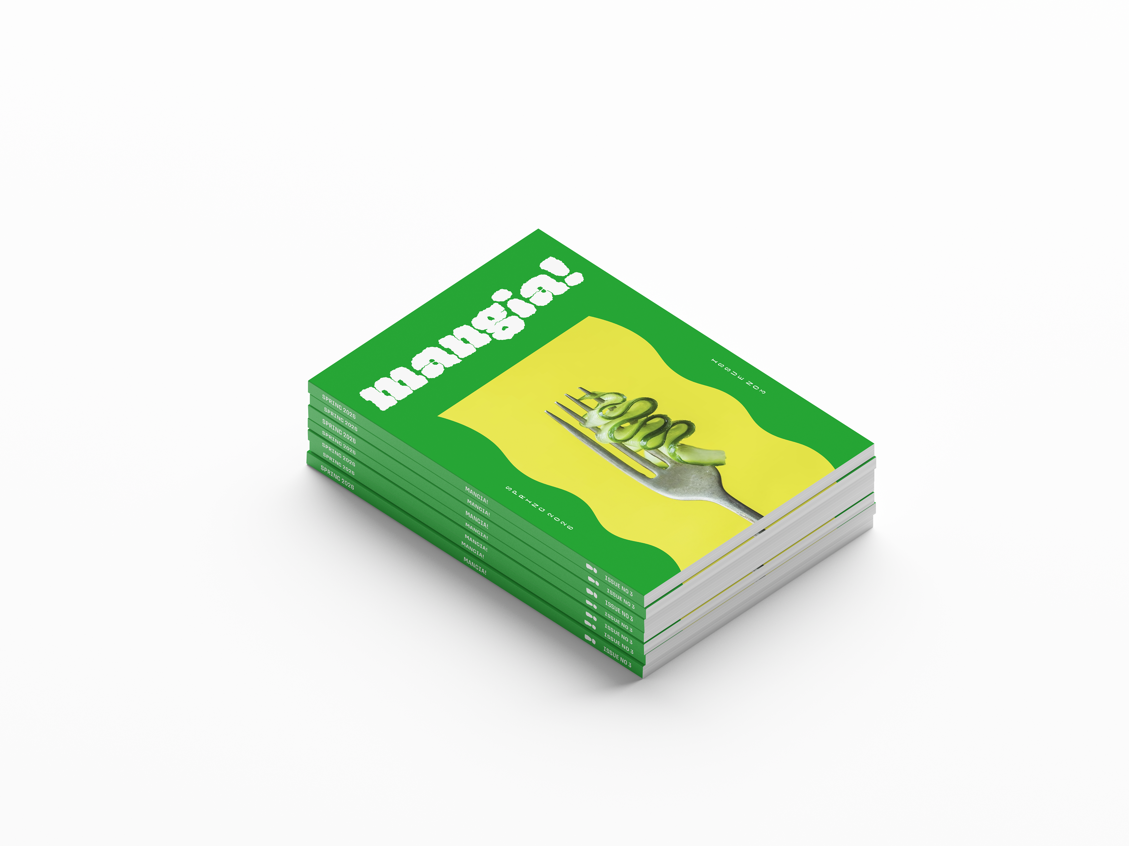
For the masthead, I chose the typeface "Gigantic" and distorted the type design to give it loose, rugged edges. Because the magazine name ends with an exclamation mark, I wanted the masthead design to feel visually loud, as if the magazine was shouting from the shelves. Both the masthead design and the bold-colored covers aim to achieve this.
Cover Design System
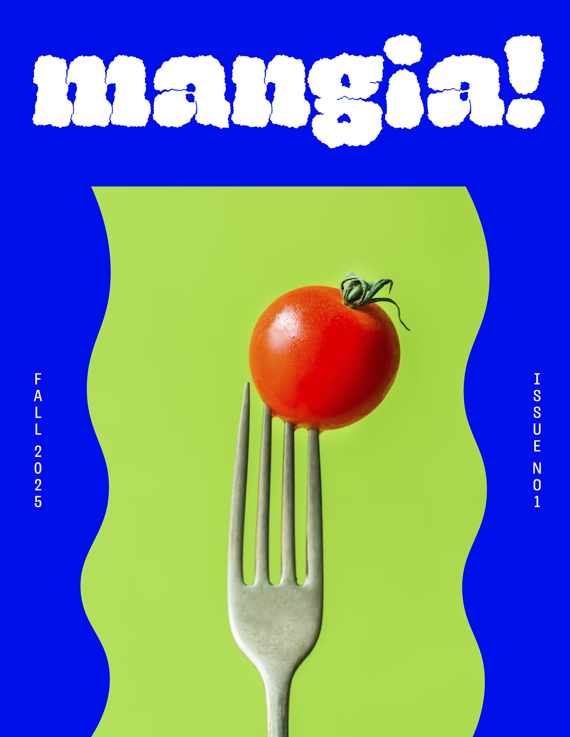
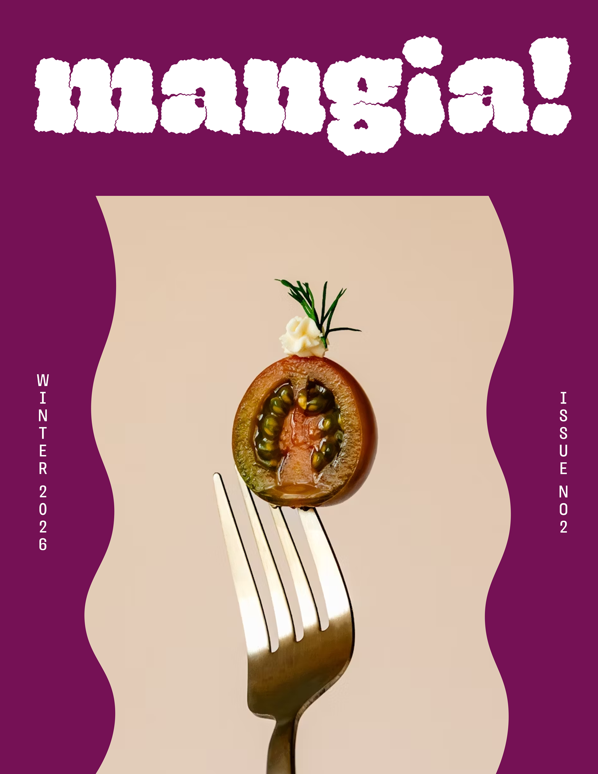
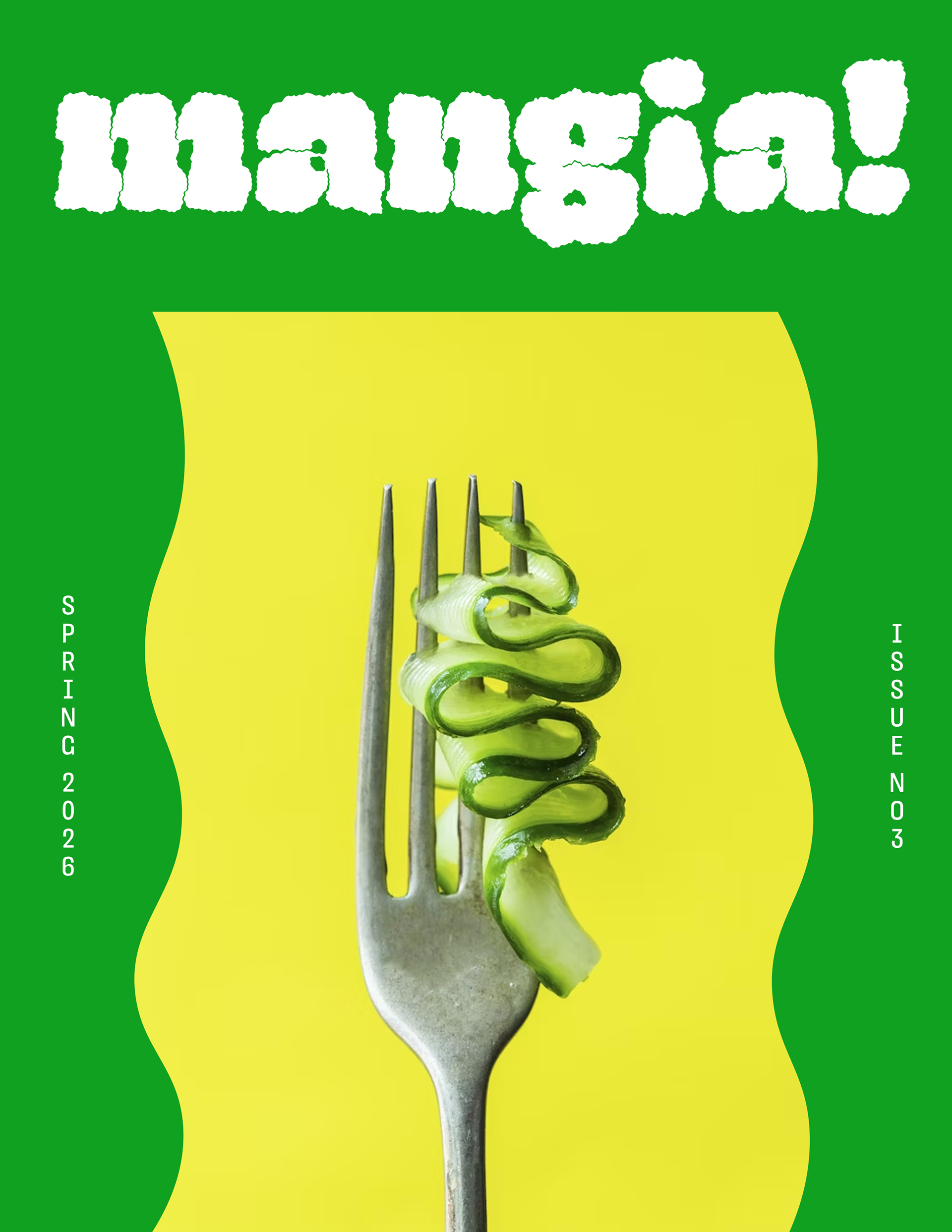
Mangia!’s design system is built to be bold, cohesive, and instantly recognizable from issue to issue, while leaving room for seasonal expression.
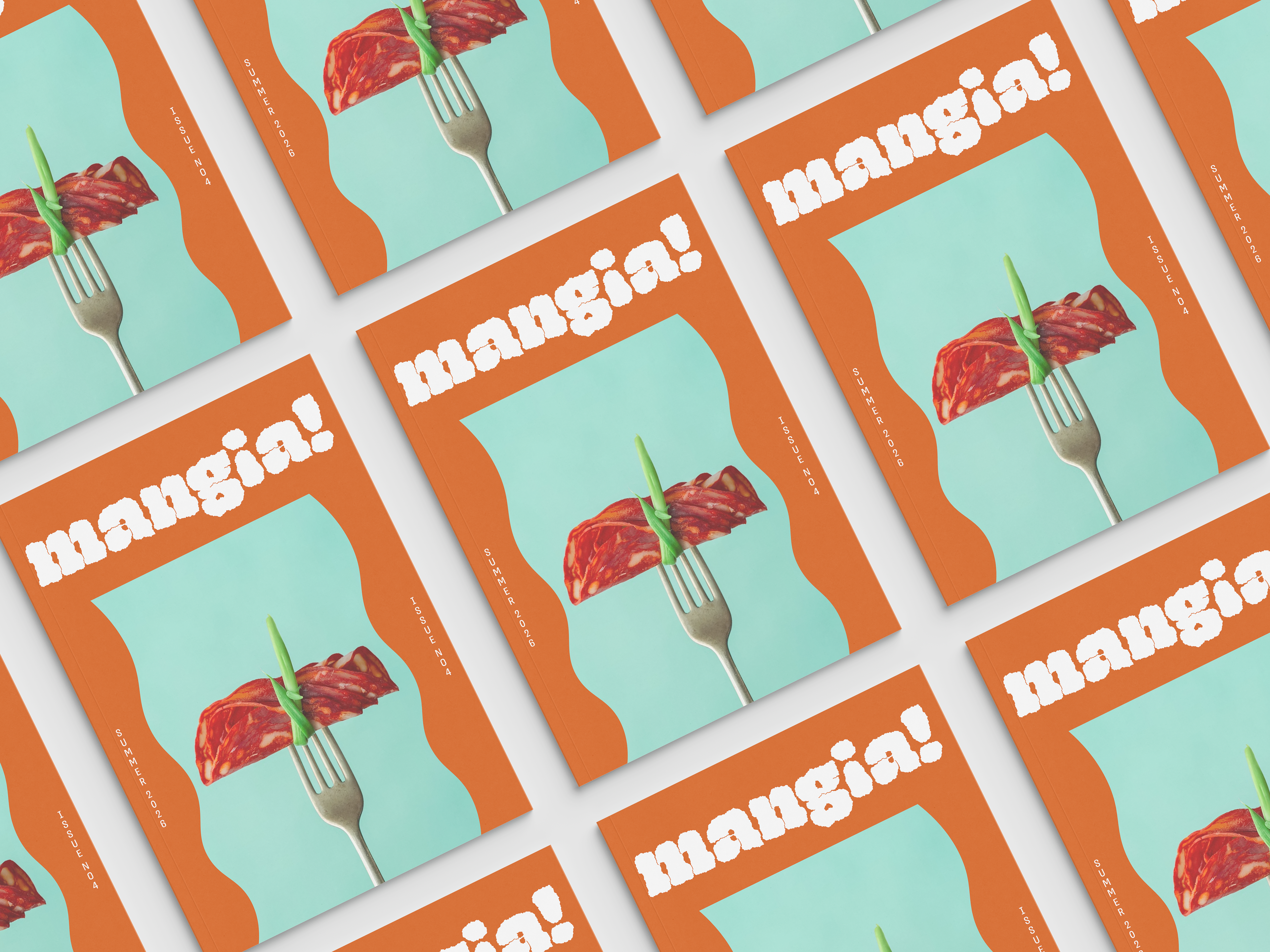
Each quarterly cover and spine features a repeatable layout energized by a rotating palette of bright, saturated hues that shift with the month — deep, rich tones for winter, bright pastels for spring, and similarly expressive colors throughout the year.
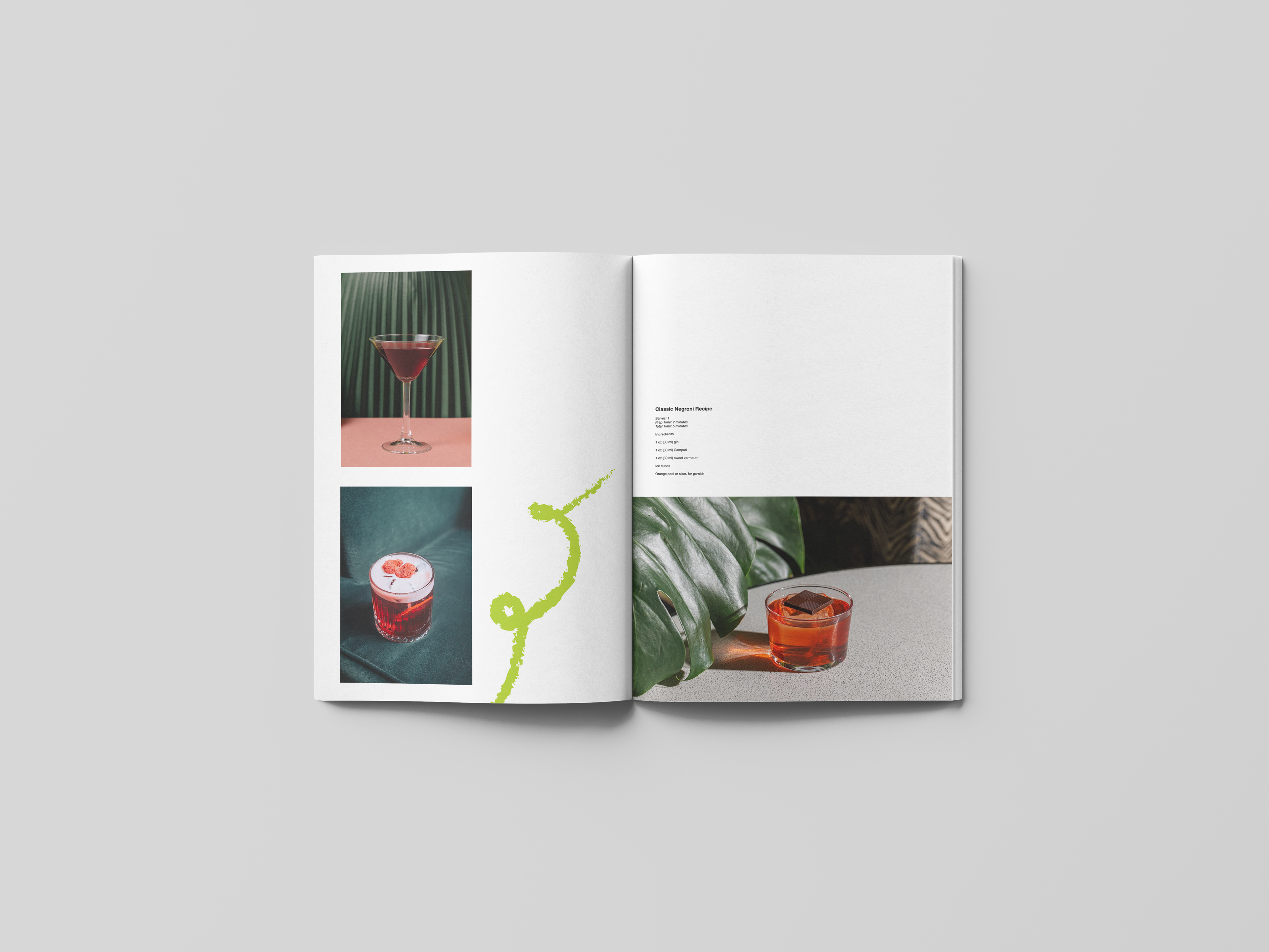
The photography follows a signature concept: a single fork lifting a seasonal ingredient (or a small cluster of them) that ties directly to that quarter’s culinary theme and editorial highlights. This consistent visual motif anchors the magazine’s identity while allowing each issue to feel fresh and timely.
Paired with Mangia!’s mix of punchy color blocks, whimsical illustrations, and lively, modern photography, the system channels the magazine’s indie, urban spirit — confident, playful, and steeped in the energy of contemporary Italian food culture across the U.S.
Interior pages
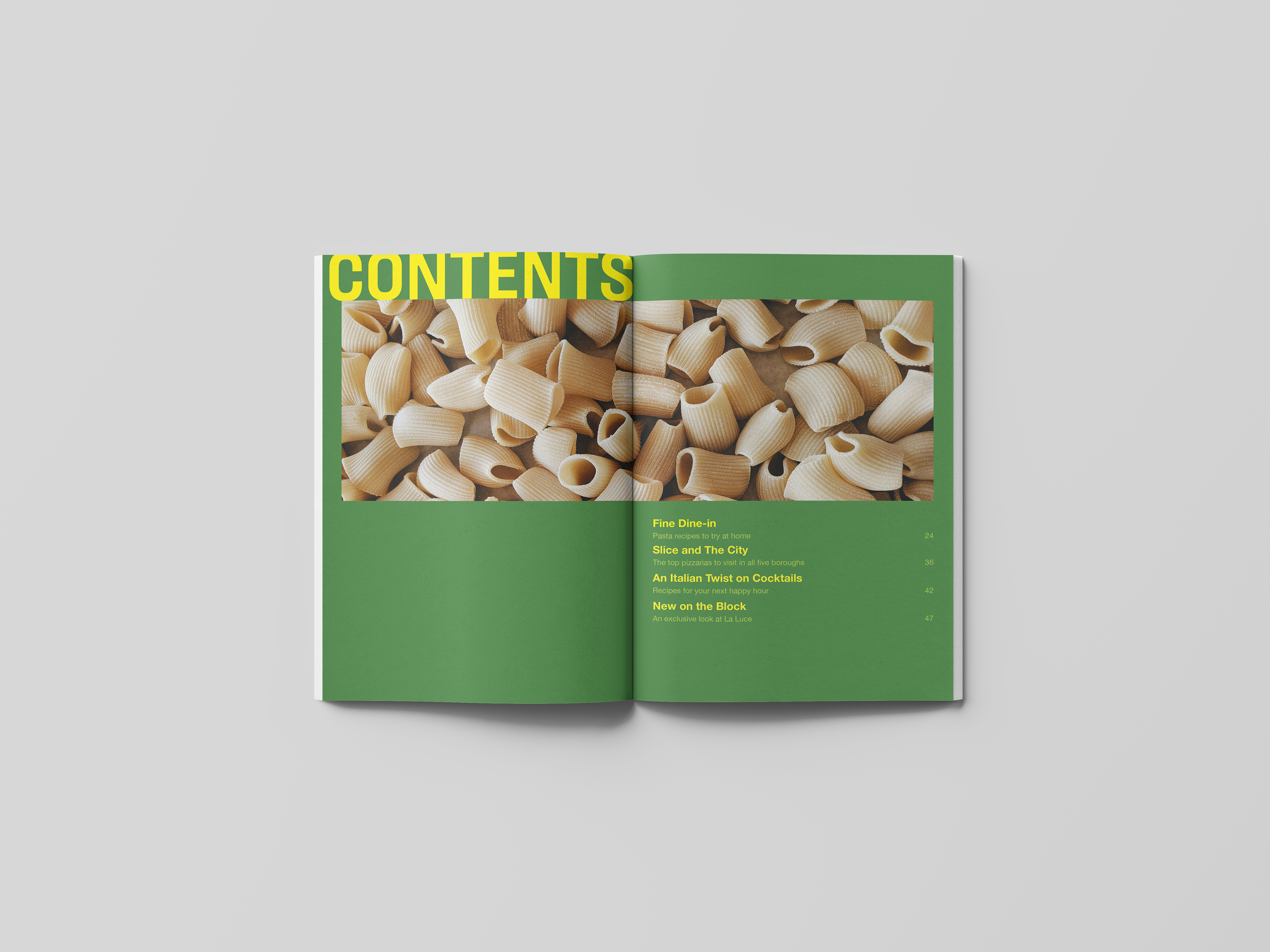
Grid Design
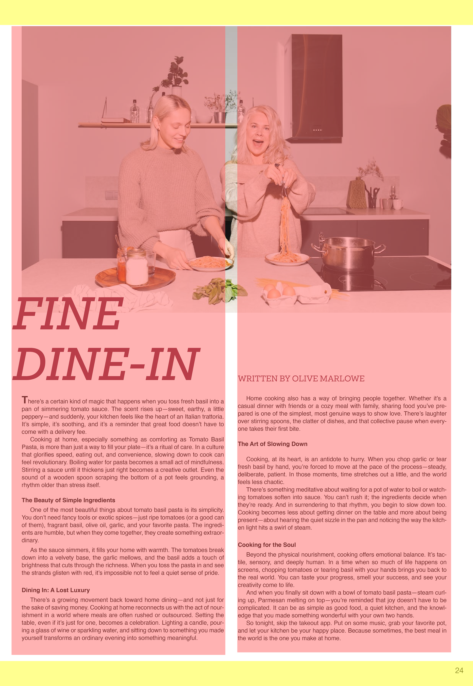
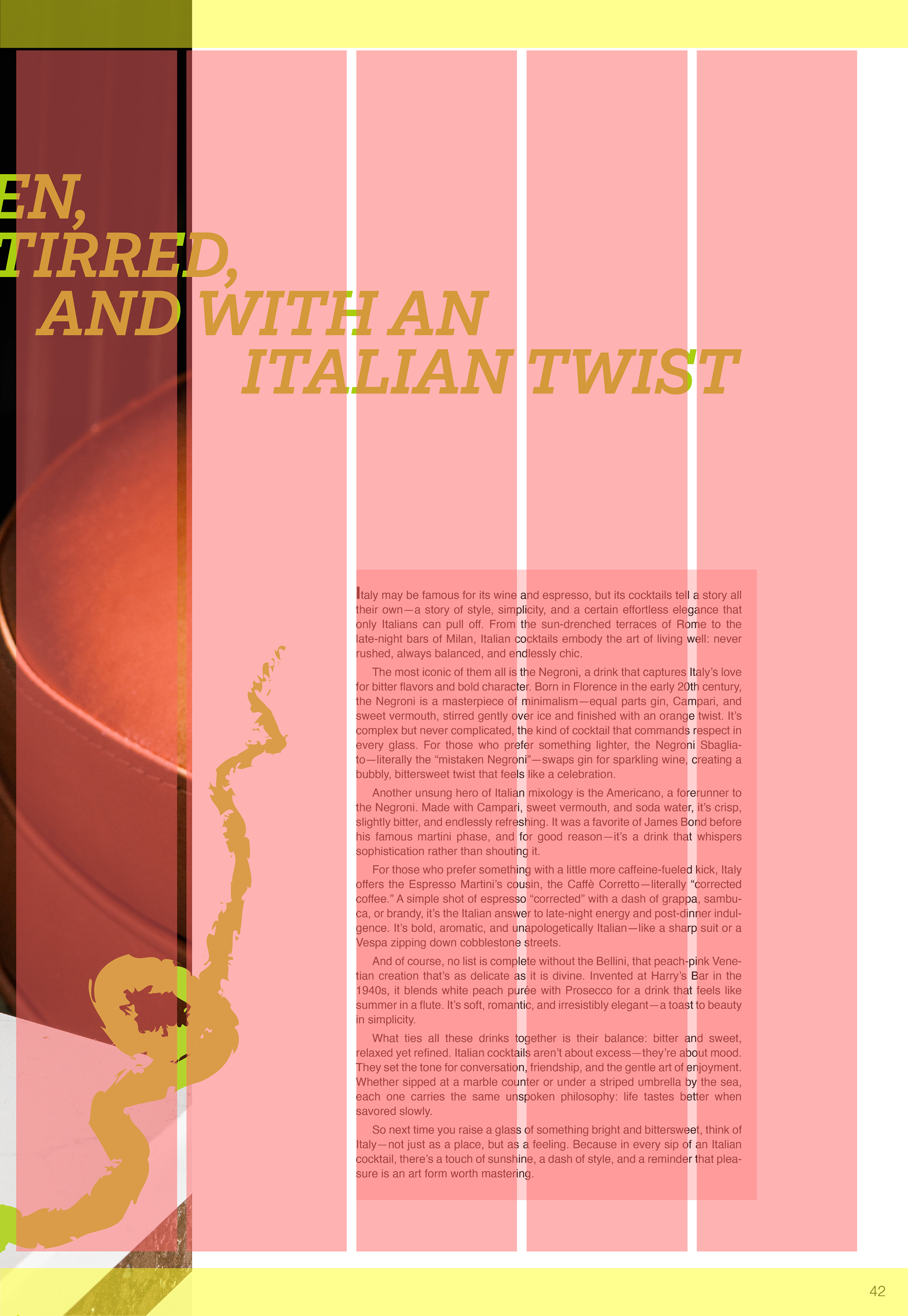
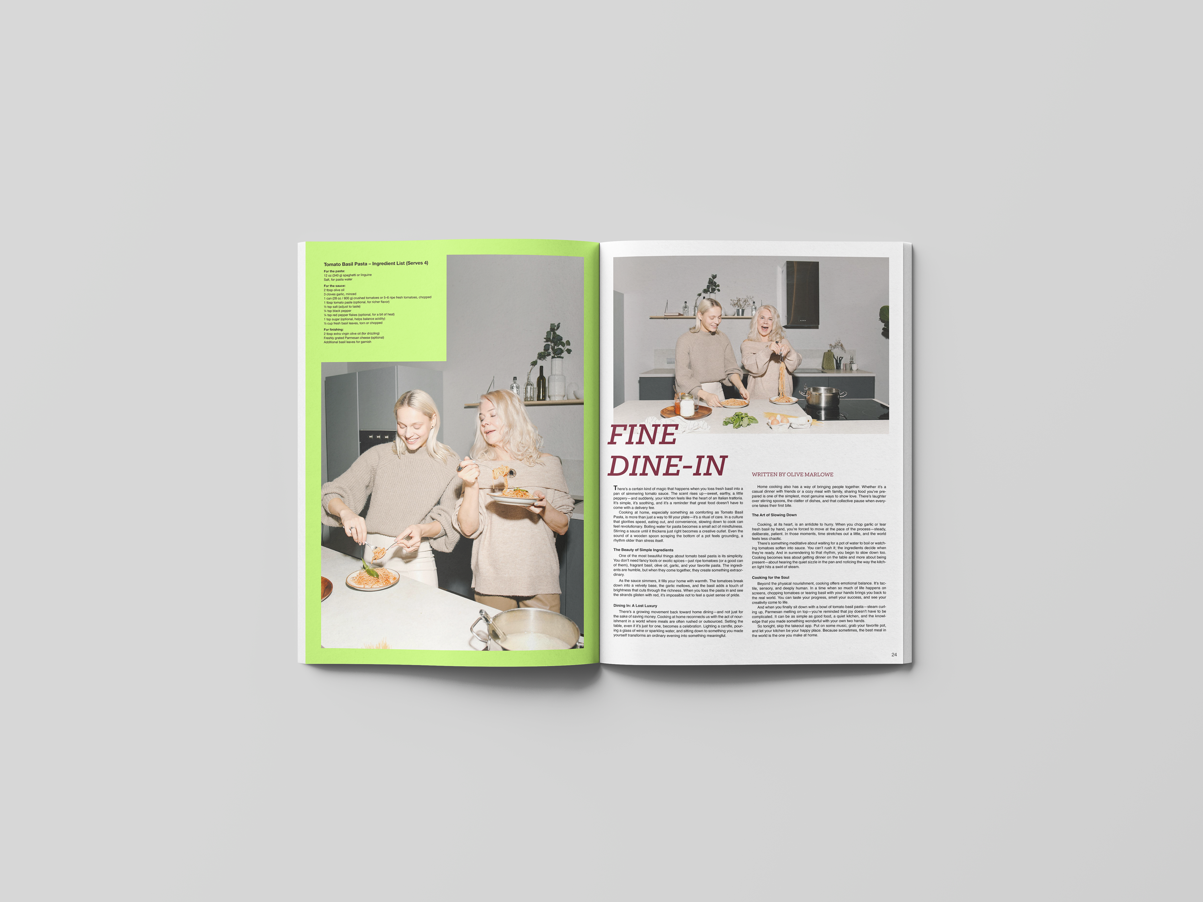
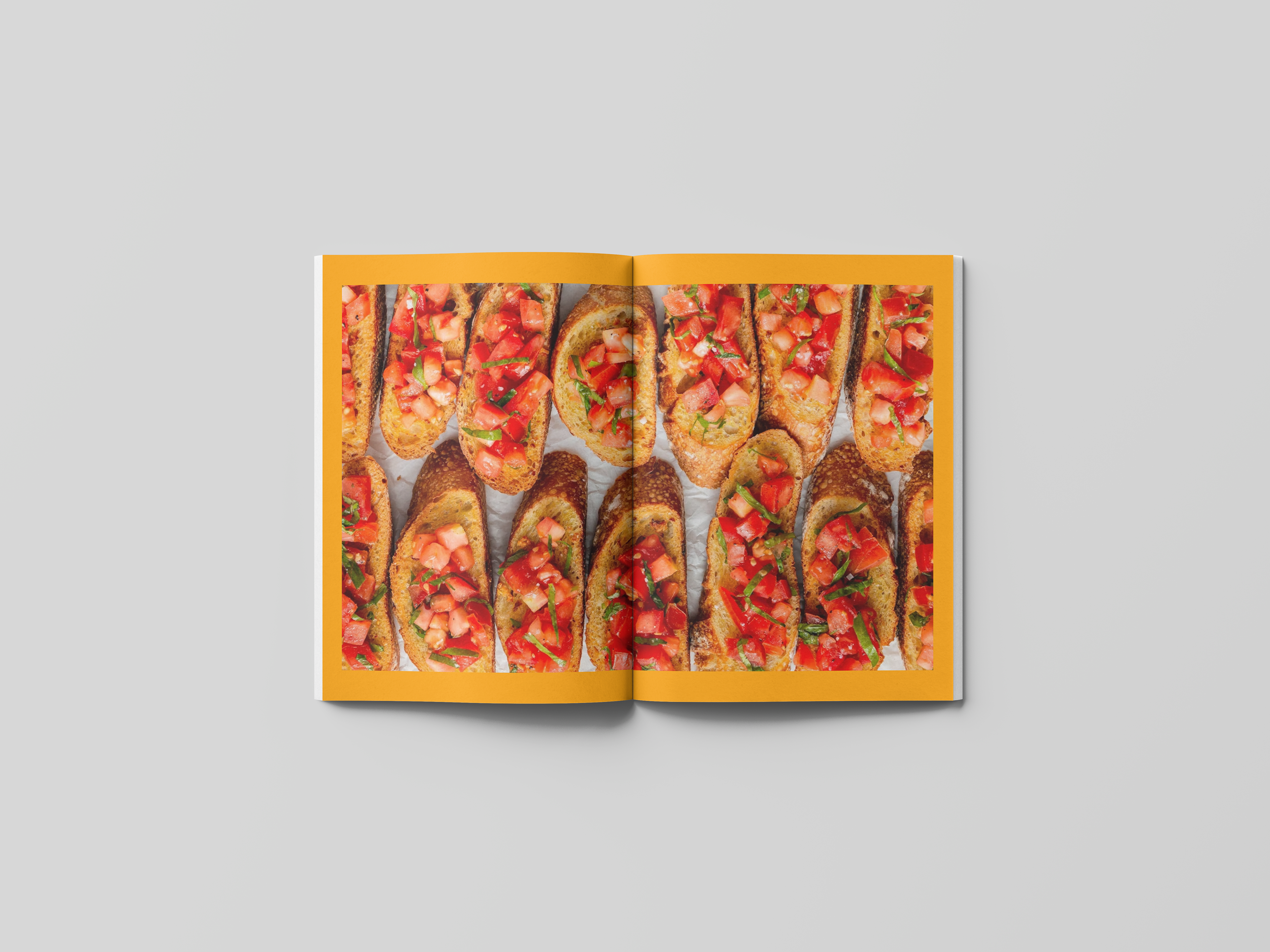
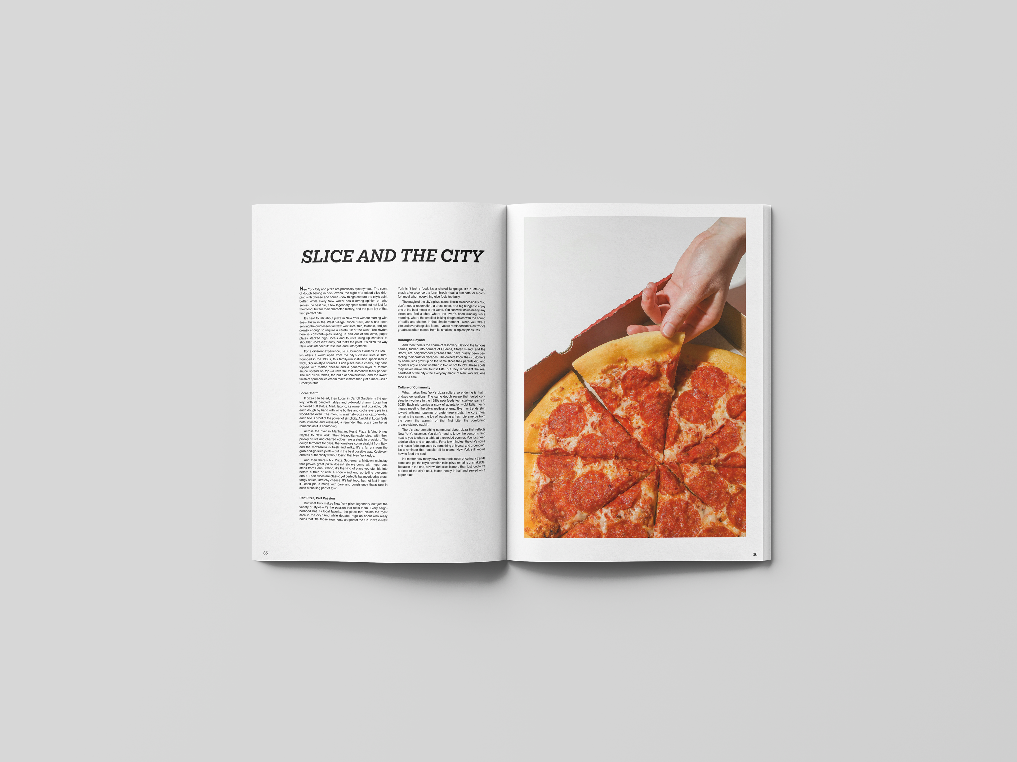
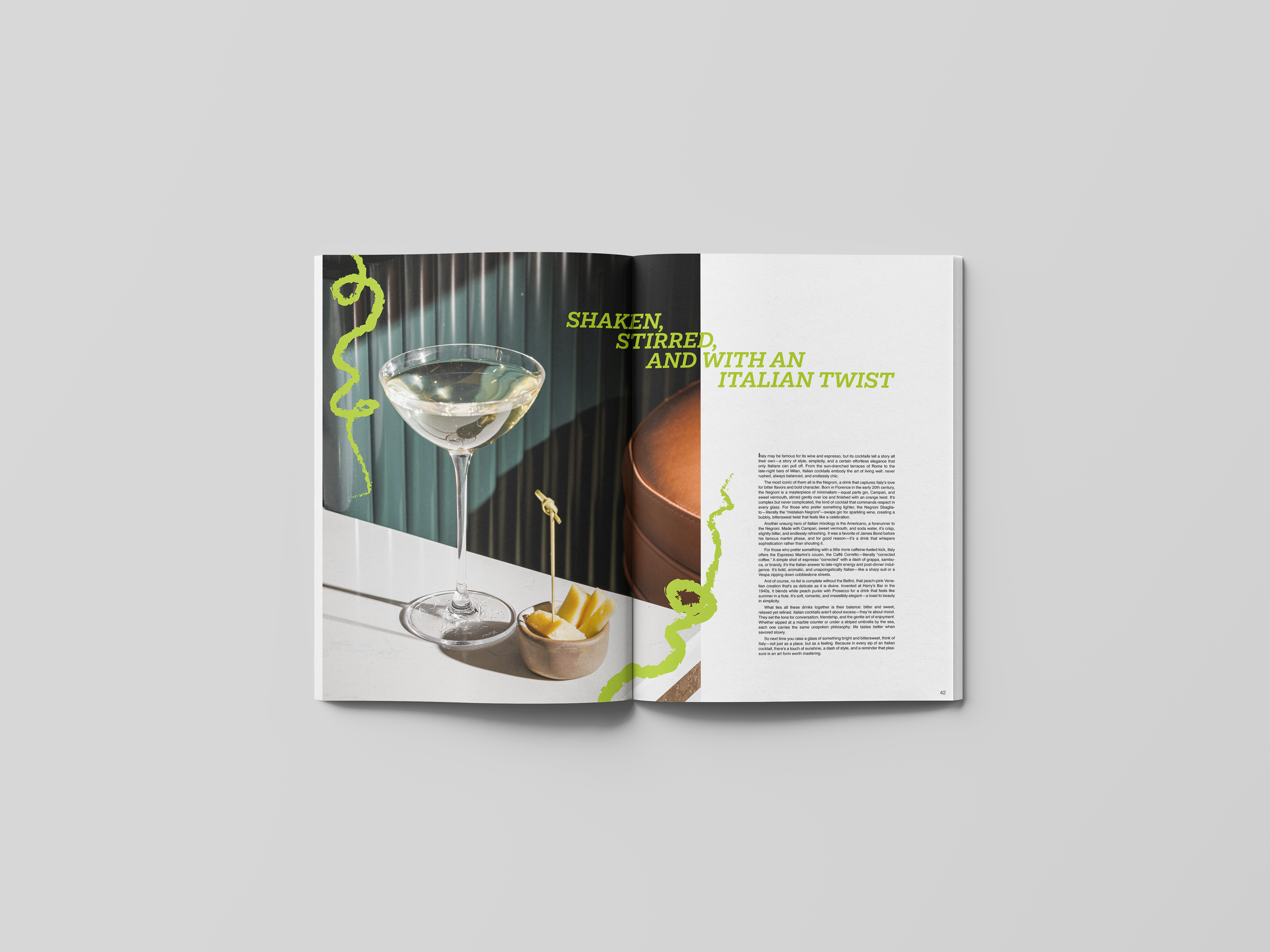
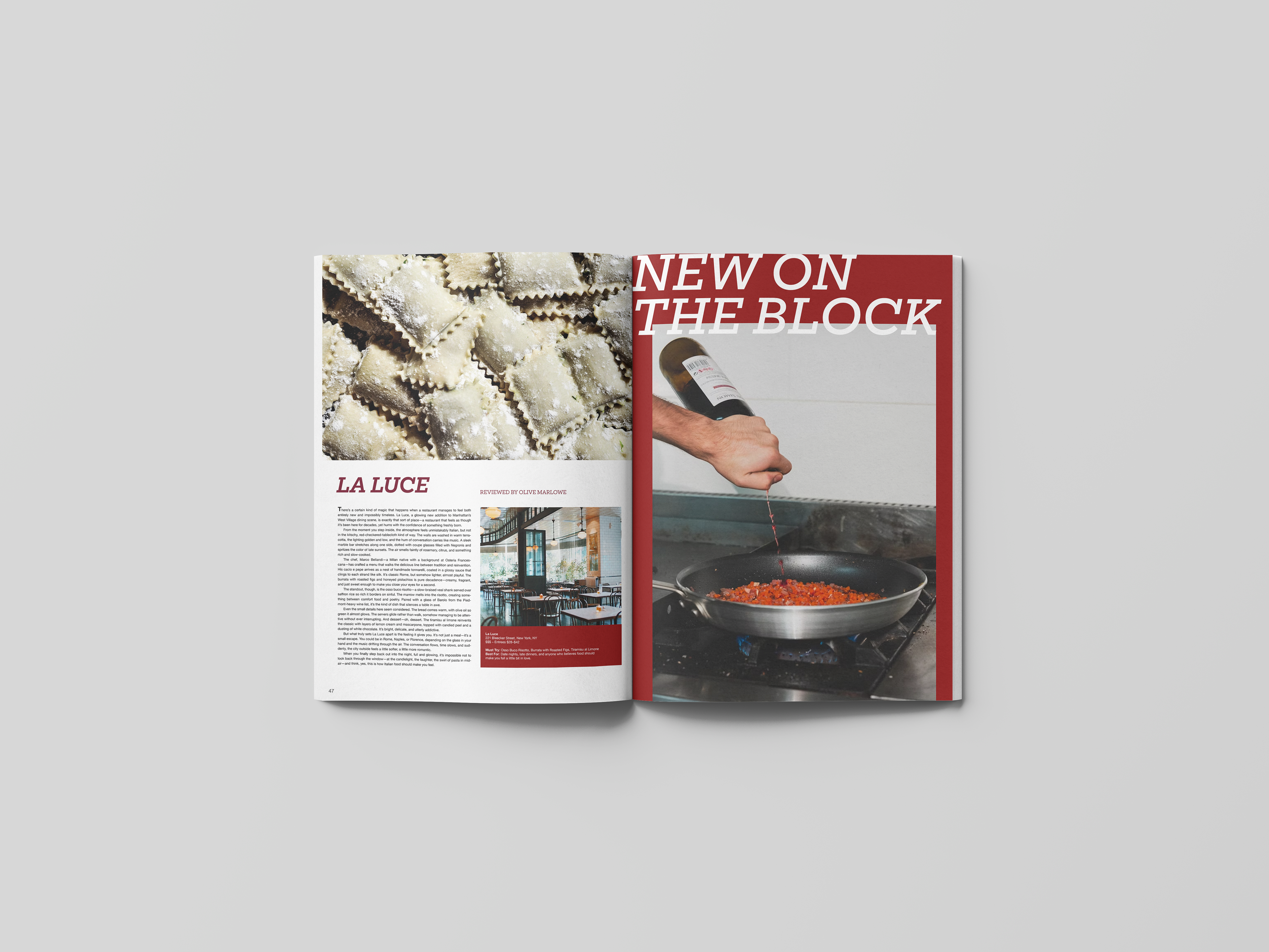
The interior spread grid system for Mangia! is intentionally flexible, shifting between airy single-column layouts with generous negative space, clean two-column structures for denser stories, and immersive full-bleed photography that stretches across the fold.
Headline titles and photography routinely break the grid to create dynamic visual interest and guide the reader’s eye through the spread with an intentional flow.
This mix creates a rhythmic reading experience that balances text and imagery, allowing the magazine to feel equal parts informative and visual — almost like a modern culinary picture book.
The result is a layout that feels open, expressive, and carefully composed, echoing the magazine’s bold, contemporary spirit.