Overview
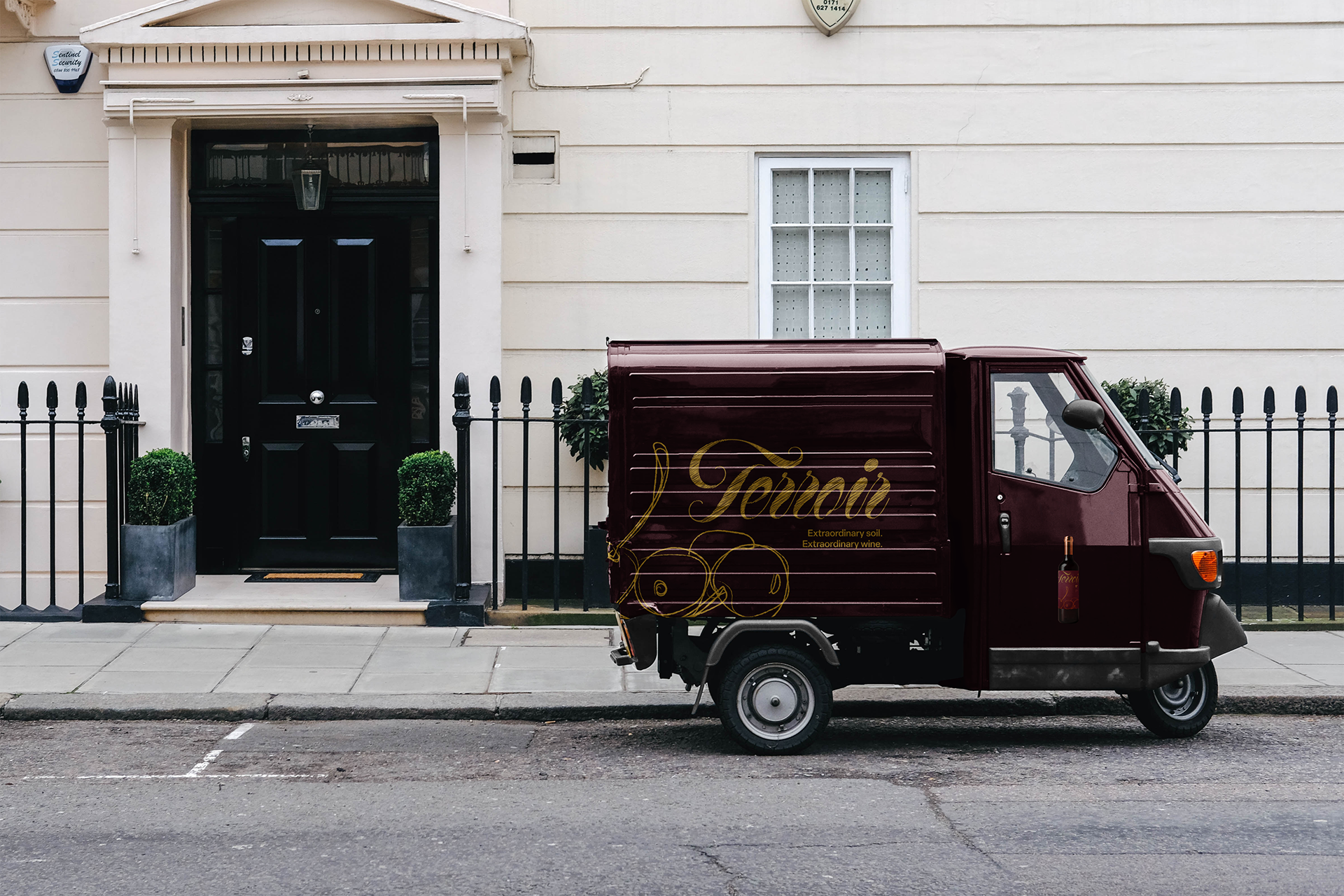
Terroir is a contemporary Santa Barbara winery rooted in time-honored craft and elevated by a modern, sustainable approach. Their name reflects their philosophy: exceptional wine begins with exceptional soil. Blending tradition with a new-age sensibility, Terroir celebrates the unique flavors shaped by our earth—bringing a sense of place to each of our carefully crafted varieties.
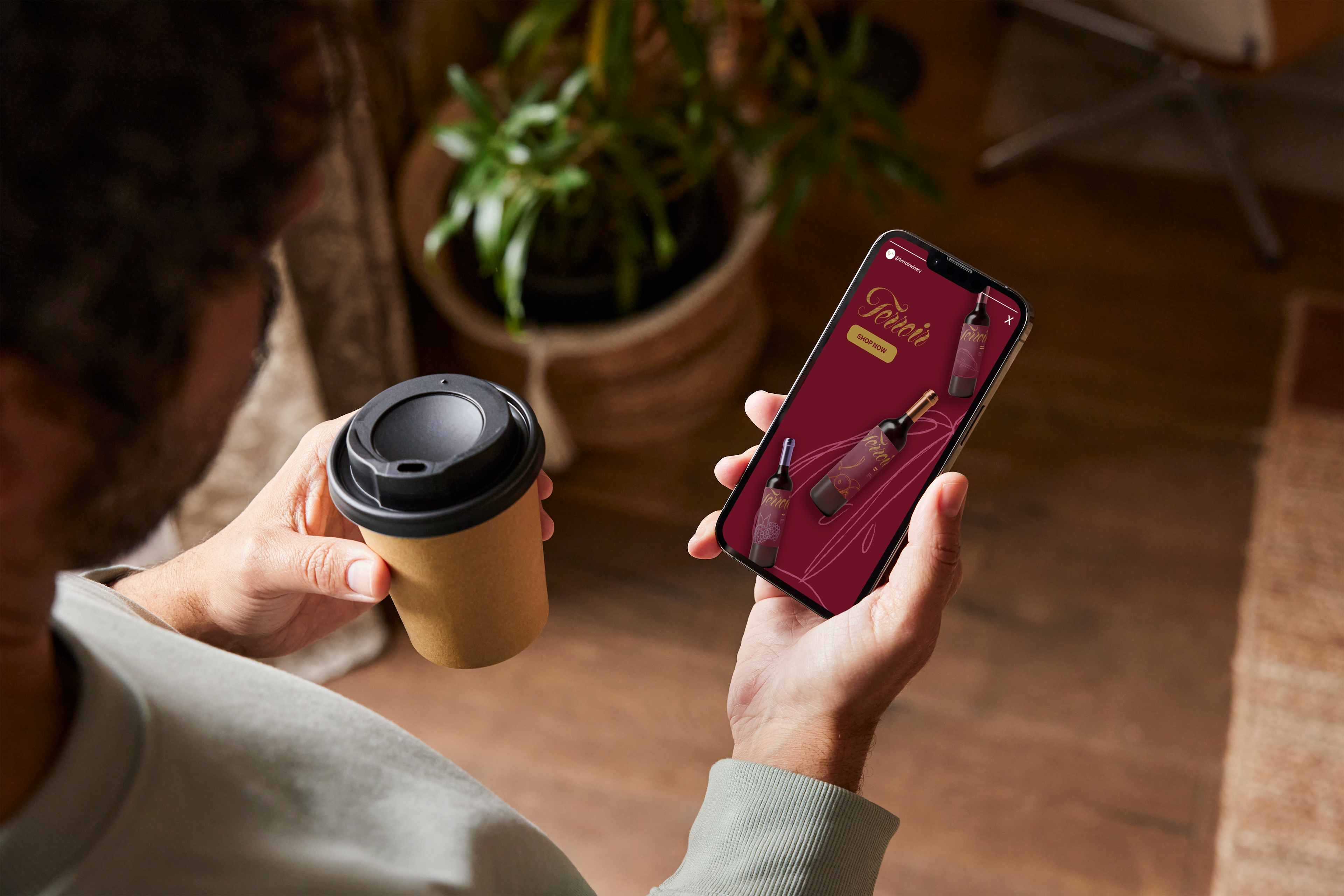
Terroir’s audience is modern, values-driven wine lovers, particularly young professionals and sustainability-minded consumers, who appreciate authentic craftsmanship and regionally expressive wines. They seek contemporary, design-forward brands that pair quality with a meaningful connection to place.
Design Direction
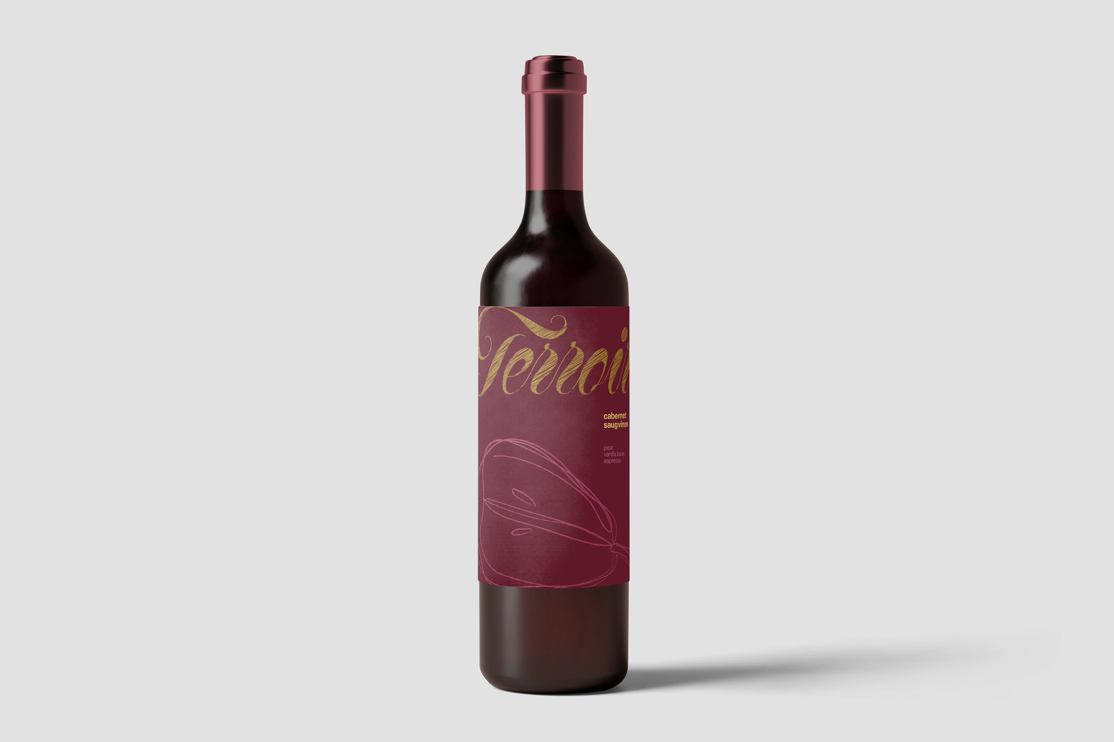
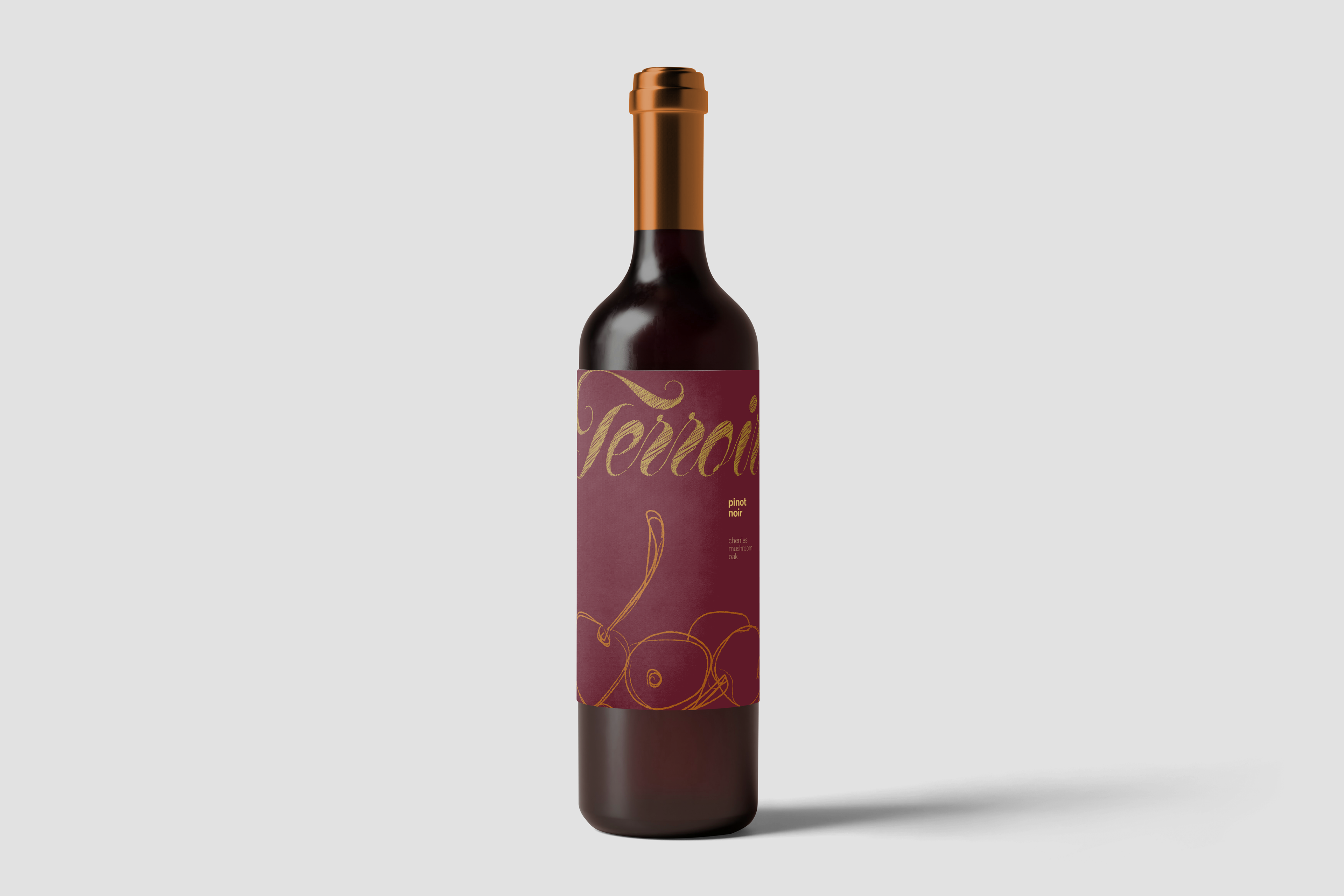
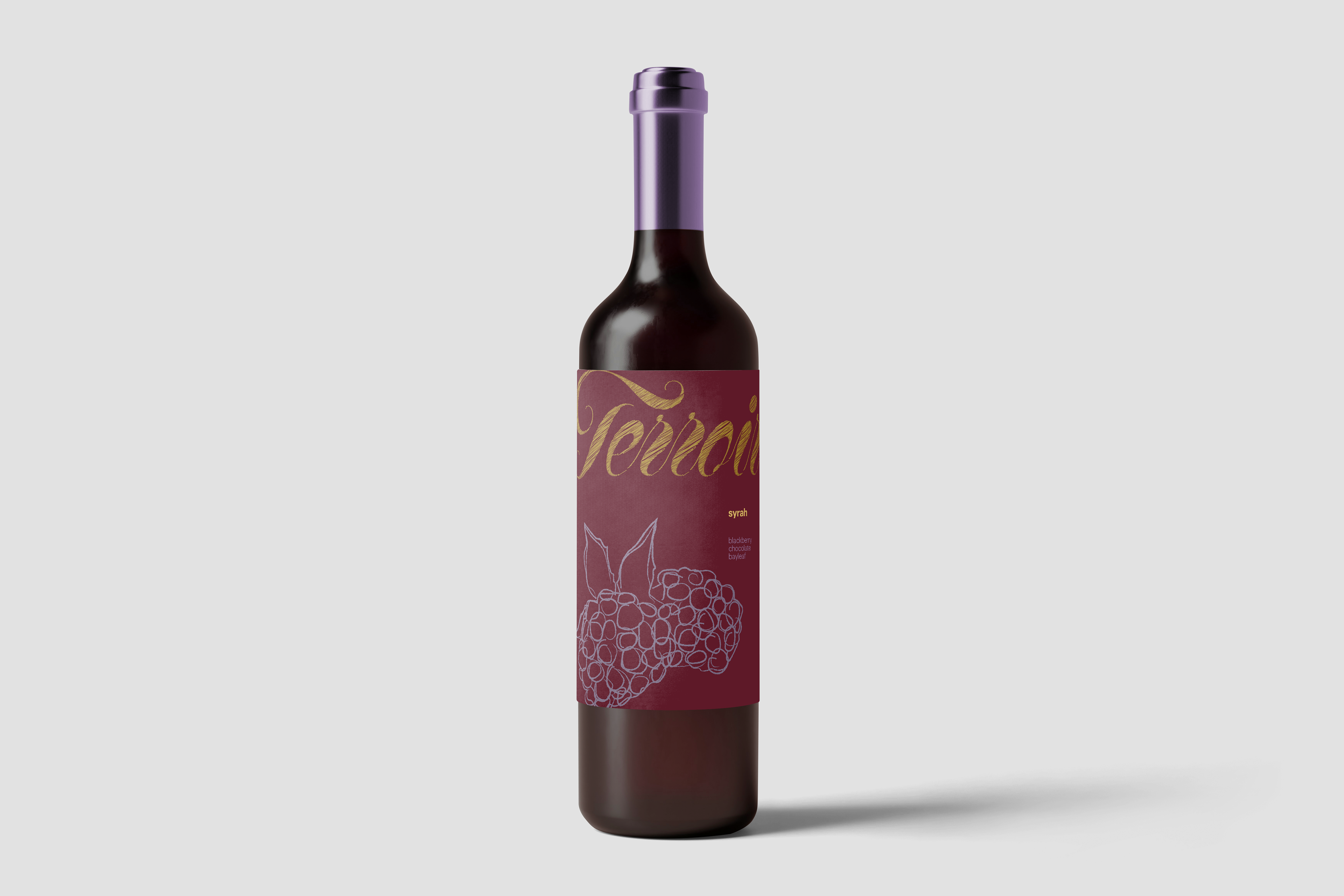
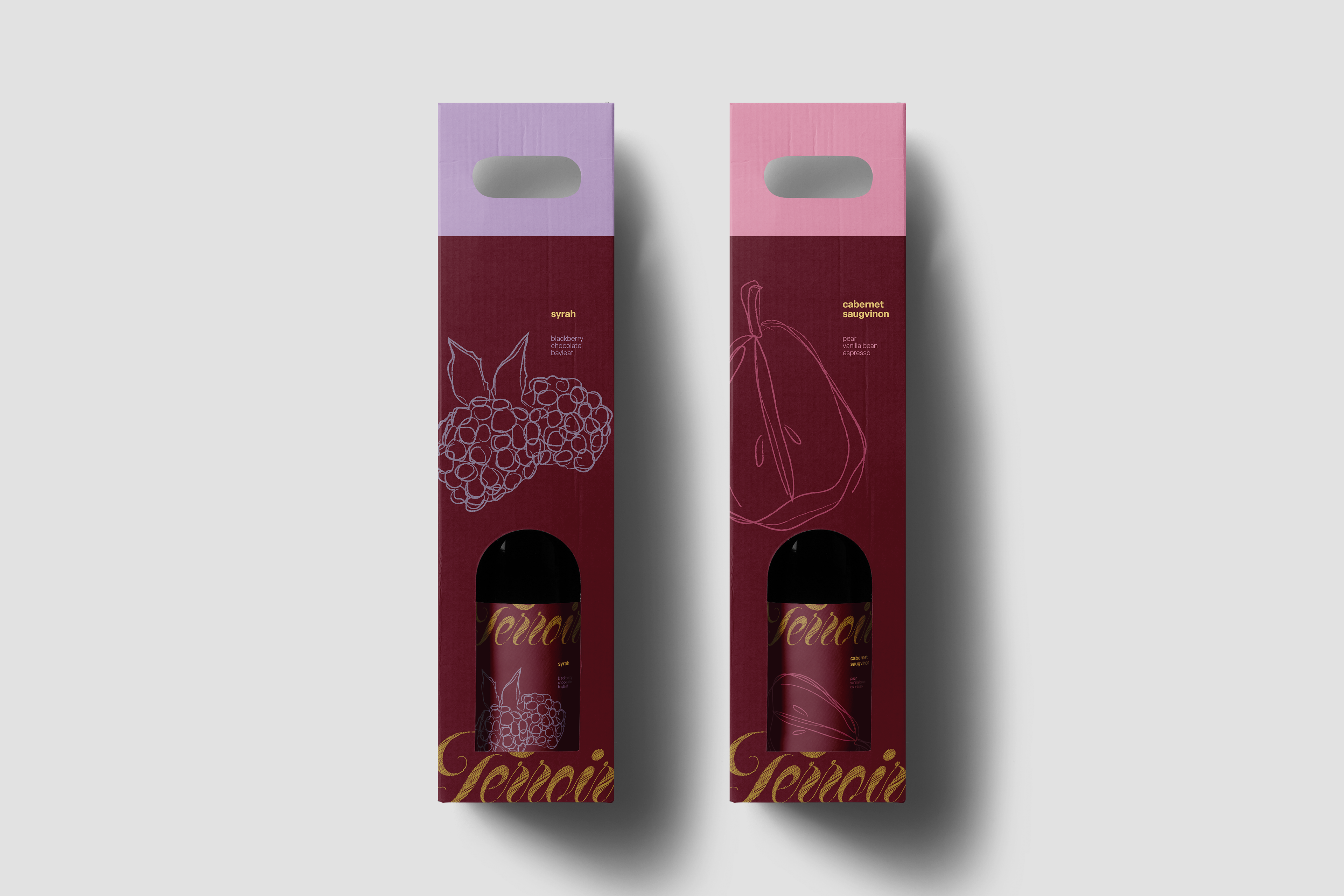
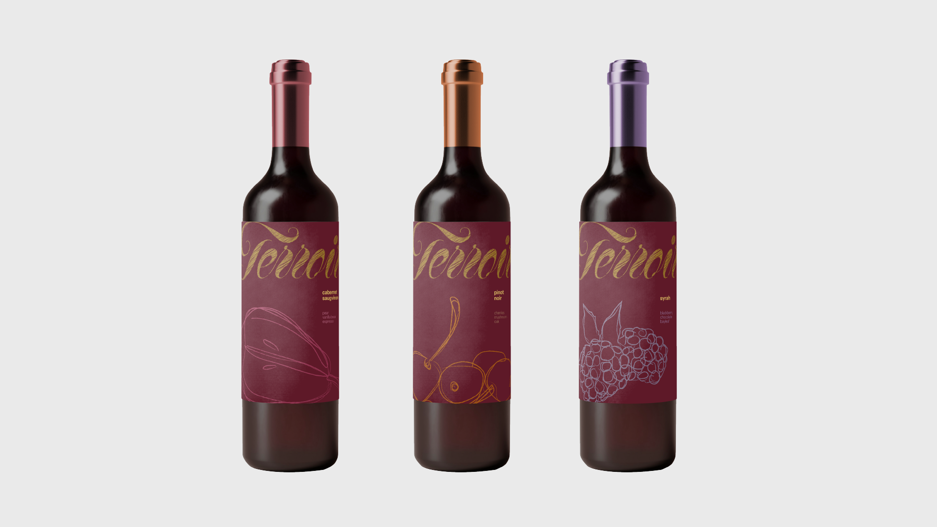
To further align with Terroir’s emphasis on soil and the natural landscape, I incorporated a hand-sketched texture into the logotype, adding a tactile, terrain-inspired quality. This sketch-like aesthetic continued into the illustration system, where each piece was intentionally drawn with a loose, organic feel. The varietal-specific accent colors were paired with corresponding illustrations to differentiate each wine while maintaining a cohesive, contemporary brand that reflects the land and craftsmanship at the heart of Terroir.
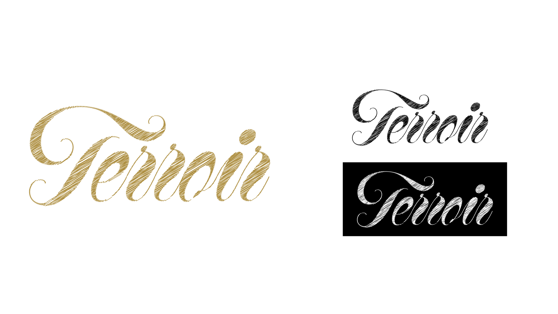
Terroir Logo
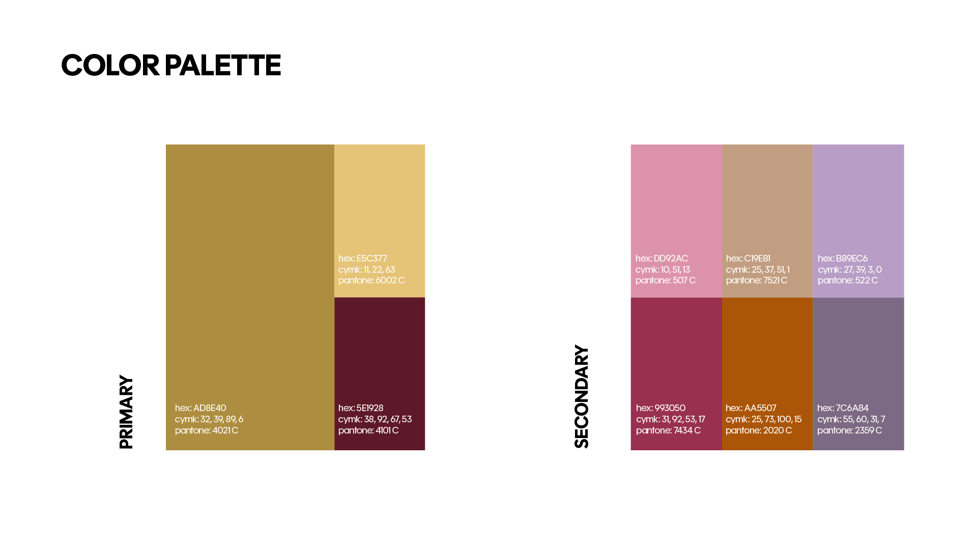
Color Palette
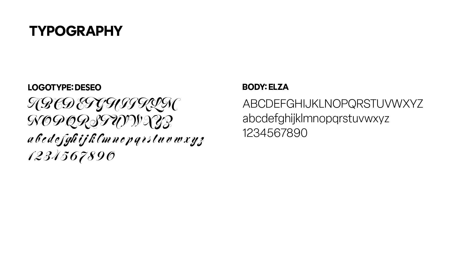
Typography
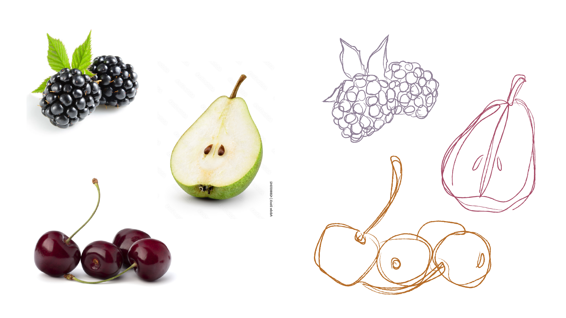
Illustration Sketches
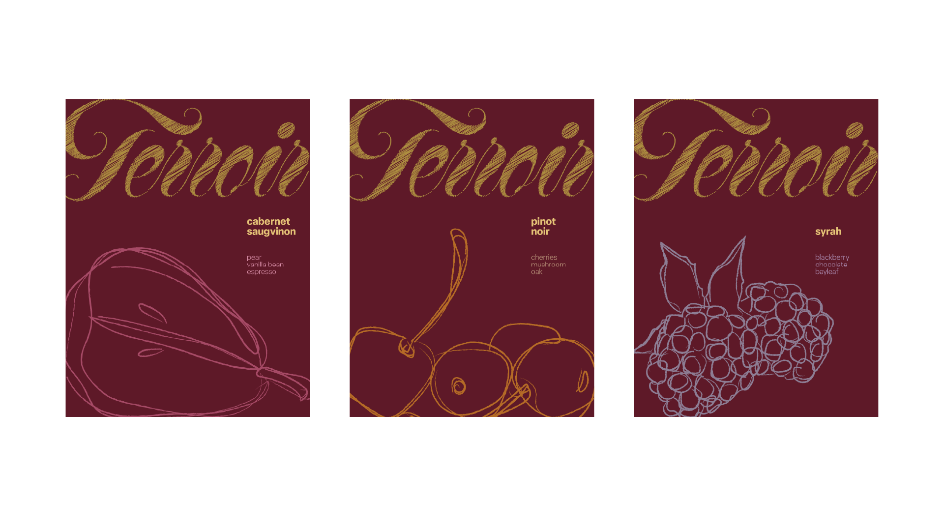
Wine Label Designs
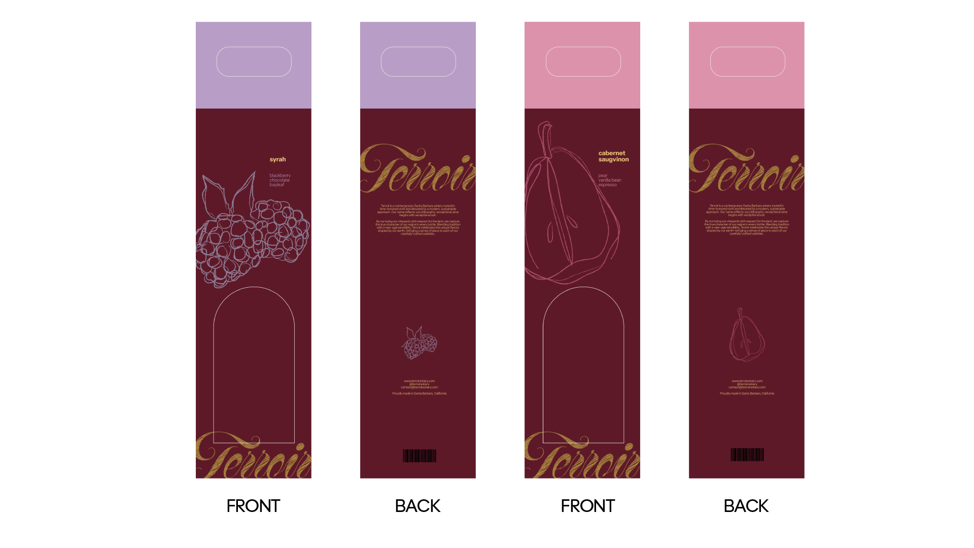
Wine Box Designs
Designs